Warm Neutrals Are Quietly Ousting Cool Grays in Perth Homes
For the better part of two decades, cool gray was the default backdrop of contemporary Australian interiors. Builders' whites were warmed up just enough with a whisper of greige, kitchens were anchored by charcoal stone, and Hamptons-style renovations leaned on soft dove tones. That era is drawing to a close in Perth, where a quieter, more grounded palette of warm neutrals — oat, putty, clay, linen, sand — is moving into the rooms where cool tones once reigned.
Perth's design community has always paid close attention to its unusual quality of light, drawn in across the Indian Ocean and bounced off the limestone of the Swan Coastal Plain. Designers working on coastal renovations in Cottesloe, heritage terraces in Fremantle, and new builds in Subiaco and Mount Lawley are finding that the same interiors feel markedly different when the walls carry warmth rather than coolness. The change is less about trend and more about how a home actually feels at six o'clock on a summer evening, when the heat eases and the family gathers.
The Slow Retreat of the Cool Palette
Cool grays were never a failure. They answered a real need: a calm, architectural backdrop for open-plan living, engineered stone benchtops, and stainless steel appliances. For a while, they also flattered concrete construction, a material favoured by Perth builders working on sloping blocks in the hills suburbs and on compact urban infill sites. Yet the more grays multiplied on Pinterest and on display home walls, the more they began to feel institutional.
Australian homeowners started asking different questions of their spaces. Instead of "how clean does this look?", the brief became "how does this room feel in winter?" and "does this colour actually suit our afternoon light?" Warm neutrals answer those questions more generously. They absorb rather than reflect, they flatter skin tones, and they sit comfortably beside the soft furnishings, sheer curtains, and timber floors that define a relaxed Western Australian home.
Reading Perth's Light Differently
The light in Perth is unlike anywhere else on the east coast. Air moving in from the Indian Ocean carries a particular softness, and the long afternoon sun throws an almost golden cast across limestone walls and concrete driveways. Designers who gather through the event program at Contemporary have been exploring how this light reads against pigment.
A wall painted in a cool slate gray can look flat and slightly bruised by sunset. A wall in raw linen, warm mushroom, or chalky biscuit will catch the same light and glow, picking up tones that shift gently through the day. This sensitivity to light is one reason why Perth painters are reporting a surge in requests for custom-tinted neutrals in the putty and oat family, rather than the off-the-shelf grays that dominated spec homes a decade ago.
Texture Carries the Weight Now
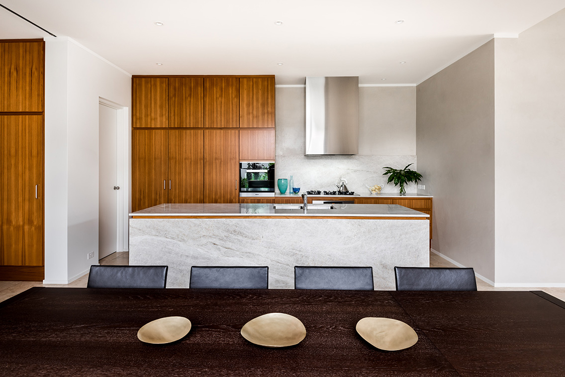
When a palette loses colour, it gains responsibility for texture. Designers replacing cool grays with warm neutrals are leaning harder on materials that bring their own variation: limewash that mottles as it dries, Venetian plaster with a soft sheen, unglazed terracotta tiles, travertine benchtops, and hand-thrown ceramics in cream and clay.
Western Australia is well served by suppliers who understand this shift. Quarried stone from the south-west, recycled brick from demolished Perth warehouses, and locally made tiles are all finding new life in projects that previously would have defaulted to a polished gray. Texture also softens the harder architectural edges of modern Perth homes, particularly those built in the flat coastal subdivisions extending from Alkimos to Mandurah, where the light can feel relentless without a material to soften it.
Local Studios Setting the Tone
A handful of Perth studios have been quietly consistent in pushing warmer palettes. Their projects — ranging from a refreshed 1920s bungalow in North Perth to a new family home in City Beach — share a refusal of the gray default. Instead, they work with earthy whites, muddied ochres, and timber tones, often sourced from Western Australian joiners who mill their own boards from salvaged marri and jarrah.
These studios sit inside a broader Perth design community that gathers at events where the conversation about colour and material is taken seriously. The exhibitor directory for the Contemporary showcase offers a useful snapshot of the makers, suppliers, and studios shaping this change, from small-batch paint producers to bespoke furniture workshops. Many of these exhibitors are experimenting with warm pigments on their own stands, walking visitors through how a single colour can shift under different lighting conditions.
Climate Has a Quiet Say
Perth's Mediterranean climate shapes its interiors as surely as its verandahs and courtyards. Long, dry summers give way to wet, mild winters, and homes are designed to stay comfortable across both. Cool grays can read as chilly in the cooler months, particularly in homes with polished concrete floors and high ceilings, which remain a popular choice in the Perth hills.
Warm neutrals behave differently. They reflect less light, which means rooms feel cosier on a July evening. They also pair more naturally with the indoor-outdoor living that Western Australians expect — a seamless slide from the kitchen to the alfresco, from the living room to the pool deck. Walls in warm clay or oat tone invite the eye to move outside, where the garden's greens and the timber decking feel like a continuation rather than a contrast. The result is a home that reads as a single, breathing space rather than a series of disconnected rooms.
Working With Australian Hardwoods
Few material combinations sing quite like warm wall colour and Australian hardwood. Jarrah, with its deep reds and rich figure, looks almost theatrical against a pale oat wall. Marri, full of gum veins and natural imperfections, settles into a putty-toned room with the ease of an old friend. Blackbutt and spotted gum, both widely available through Perth timber yards, add a cooler warmth that balances clay and terracotta.
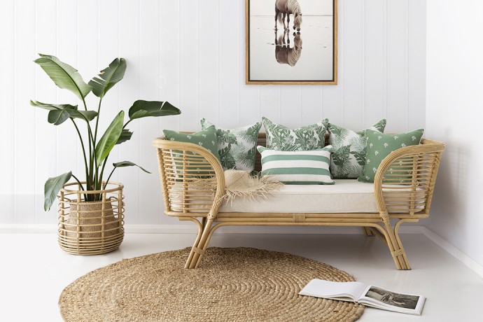
Designers are increasingly specifying these timbers not just for floors but for joinery — kitchen islands, window seats, full-height shelving — and treating them as the primary warm element in the room. The wall colour becomes a quieter companion, letting the timber speak. This approach also gives homeowners permission to keep their soft furnishings simple: a Belgian linen sofa, raw silk curtains, and unglazed pottery all sit comfortably in such a space without competing for attention.
Bringing the Palette Home
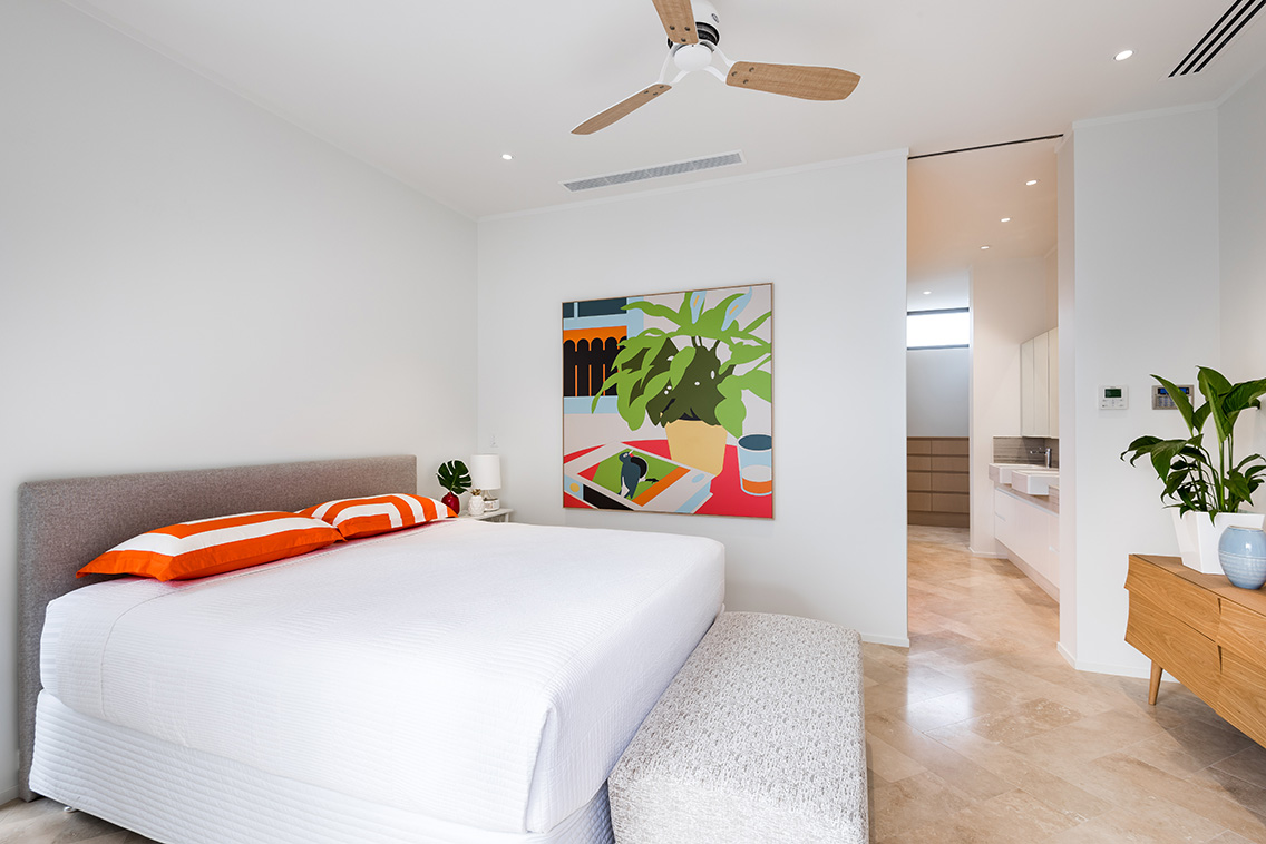
Adopting a warm neutral palette does not require a full renovation. The most successful shifts often start small — a single wall repainted in a custom tint, a bedroom linen change, a piece of furniture recovered in raw linen. Painters in Perth will often mix a small sample pot to test against the home's afternoon light before committing to a room.
It is also worth visiting local suppliers in person. Stone yards in Osborne Park, tile showrooms in Malaga, and timber suppliers in Welshpool all stock materials that read differently under a Perth sky than they would in a Sydney or Melbourne showroom. Touching the surface, seeing the variation, and asking about the provenance of the stone or the timber helps a homeowner choose with confidence. The shift away from cool grays is not about abandoning minimalism; it is about giving minimalism somewhere warmer to land.
The upcoming Contemporary showcase offers an ideal starting point for anyone considering the change. Tickets and event details are available through the platform, and the program features talks, installations, and rooms designed by Perth's leading studios — a chance to see these warm palettes in conversation with the materials, makers, and ideas behind them.