Why Green Is Defining Australian Interiors This Year
Why the color green is dominating Australian interior design this year is less about a single fashionable paint shade and more about a wider shift in how people want spaces to feel. Across homes, hospitality venues, workplaces, and public interiors, green is being used to create rooms that seem grounded, restorative, and connected to the landscape beyond the walls.
Australian designers have long worked with the country’s distinctive light, vegetation, and raw materials. The current interest in green brings those references indoors through eucalyptus, olive, moss, jade, celadon, and deep forest tones. Each shade offers a different atmosphere, from quiet and mineral to theatrical and immersive.
The trend also reflects a desire for interiors with greater emotional depth. After years of pale neutrals and highly edited minimalism, colour is returning with confidence. Green provides an adaptable middle ground: it can be calm without becoming bland, expressive without overwhelming a room, and contemporary while still feeling familiar.
A Colour Rooted In The Australian Landscape
Green has a particularly strong cultural and environmental resonance in Australia. It appears in coastal scrub, jarrah forests, suburban gardens, tropical foliage, and the silvery leaves of native plants. When designers bring these tones into a scheme, the result can feel specific to place rather than imported from a global mood board.
In Western Australia, the relationship between colour and landscape is especially pronounced. The rich greens of Perth’s established gardens contrast beautifully with sandy neutrals, limestone, timber, and the warm reds of local brick. In the south-west, darker botanical shades echo karri and tuart forests, while softer sage tones complement the muted palette of coastal towns.
This connection gives green a sense of permanence. A painted wall, tiled splashback, or upholstered chair in the right shade can make a room feel connected to its setting, even in a dense urban environment. The colour becomes part of an architectural response rather than a decorative afterthought.
From Accent Detail To Architectural Gesture
Green is moving well beyond cushions, indoor plants, and occasional furniture. Designers are applying it to joinery, ceilings, bathroom surfaces, cabinetry, and entire rooms. This broader use gives the colour architectural weight and allows it to shape circulation, proportion, and mood.
In residential interiors, a saturated green kitchen can turn storage into a defining feature. A green bathroom can create a cocooning retreat, especially when paired with stone, brushed metal, or handmade tile. In commercial settings, green walls and furnishings can soften hard edges, support biophilic design, and establish a memorable identity for a restaurant, studio, or hotel.
The growing confidence around colour is also visible in the local design community. At Form Wrap Party, design professionals and makers gather around the conversations, projects, and ideas shaping the Australian scene. That exchange matters because colour trends gain meaning when they are tested in real spaces and discussed by the people designing them.
Choosing The Right Green For Australian Light
The success of a green interior depends on more than the colour card. Australian sunlight can be intense, directional, and highly changeable, shifting a shade from cool in the morning to warm by late afternoon. The orientation of a room, its glazing, and the surrounding materials all influence how green will appear.
Pale sage and eucalyptus tones work well in rooms where softness and openness are priorities. They can make a compact space feel considered without visually closing it in. Olive and moss shades offer more warmth, especially alongside timber, aged brass, terracotta, and tan leather. Forest and bottle greens create drama in dining rooms, studies, bars, and joinery.
| Green Direction | Atmosphere | Materials That Complement It | Suitable Applications |
|---|---|---|---|
| Sage and eucalyptus | Airy, calm, understated | Pale timber, linen, limestone | Bedrooms, kitchens, wellness spaces |
| Olive and moss | Warm, grounded, tactile | Terracotta, walnut, brass | Living rooms, restaurants, entry halls |
| Emerald and jade | Energetic, polished, expressive | Marble, chrome, lacquer | Bathrooms, bars, feature joinery |
| Forest and bottle | Deep, intimate, enveloping | Dark timber, leather, bronze | Studies, dining rooms, hospitality interiors |
| Celadon and grey-green | Quiet, refined, contemporary | Concrete, brushed steel, wool | Offices, galleries, minimalist homes |
Sampling remains essential. A colour that looks balanced in a showroom may become unexpectedly blue, yellow, or muddy under a project’s lighting conditions. Designers are increasingly testing large painted panels, fabric swatches, tiles, and joinery finishes at different times of day before committing to a final specification.
The Materials That Make Green Feel Current
Green feels especially relevant when it is supported by tactile, natural materials. Smooth paint against rough stone, ribbed glass, woven textiles, and timber creates contrast without relying on multiple loud colours. This layered approach keeps a green scheme sophisticated and prevents it from becoming overly themed.
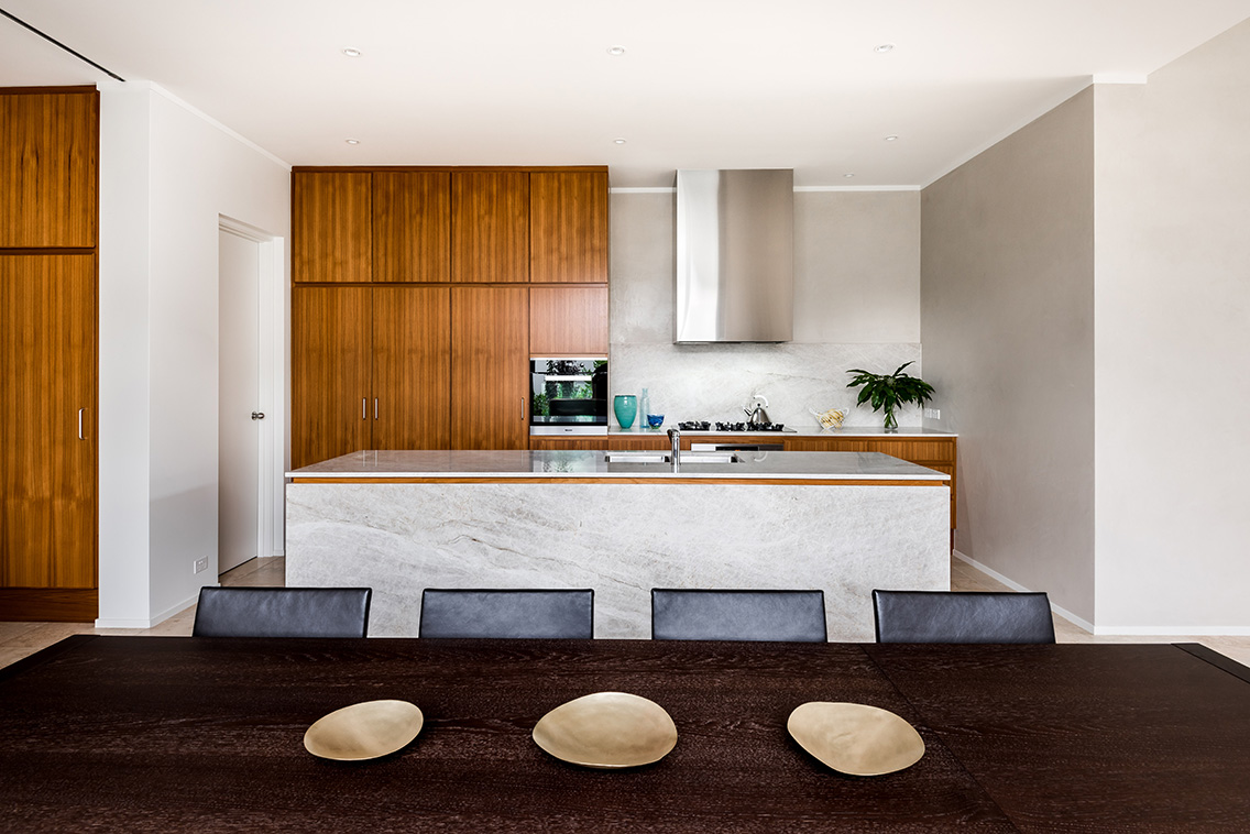
Stone is a particularly effective partner. Veined marble can bring movement to a deep green kitchen, while pale limestone can make an olive wall feel lighter and more architectural. Timber adds warmth, with light oak creating a Scandinavian softness and darker Australian hardwoods producing a richer, more enveloping effect.
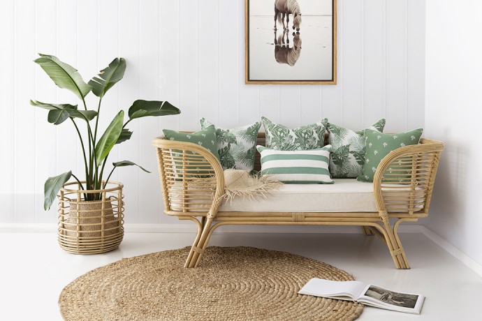
Textiles offer a lower-commitment way to explore the trend. Wool upholstery, linen curtains, patterned rugs, and velvet cushions can introduce green in varying intensities. Designers are also using green ceramic tiles, recycled glass, powder-coated steel, and coloured grout to give the palette more depth across kitchens, bathrooms, and commercial fit-outs.
The most successful schemes rarely rely on a single green surface. They combine related tones, allowing a muted wall, a darker chair, and a brighter botanical note to sit together. This tonal layering makes the interior feel collected over time rather than assembled from one seasonal purchase.
Why Green Works Across Residential And Commercial Spaces
Green has an unusual ability to perform in different types of interiors. In a home, it can signal rest, privacy, and connection to nature. In an office, it can make a workplace feel less corporate and more welcoming. In hospitality, a strong green identity can help a venue become recognisable without resorting to excessive branding.
The colour also supports changing expectations around wellbeing. While green cannot replace good ventilation, daylight, acoustic comfort, or thoughtful planning, it contributes to the emotional character of a space. Its associations with vegetation and natural environments can make rooms feel calmer, particularly when paired with daylight and living planting.
For designers, this versatility makes green a practical specification choice. It can move between heritage and contemporary architecture, coastal and urban settings, restrained and expressive interiors. A single palette may be adapted through finish and saturation rather than abandoned altogether.
Programming and professional exchange help these applications evolve. The event program offers a useful window into the broader conversations shaping local architecture and design, where materials, sustainability, craft, and community are considered alongside visual impact. Green sits comfortably within that discussion because it links aesthetics to atmosphere and place.
Making A Green Interior Feel Personal
The colour is currently popular, but that does not mean every green interior needs to look alike. Personal interpretation is what separates a lasting scheme from a short-lived trend. A homeowner may use a smoky green on a hallway ceiling, while a designer might specify jade cabinetry or a forest-toned banquette for a small wine bar.
Scale is one of the simplest ways to control the effect. Green accessories and artwork offer a gentle entry point, while a single wall can establish a stronger visual anchor. Painting skirting boards, doors, and trims in the same family as the walls creates a seamless, enveloping effect; using a contrasting trim makes the colour feel sharper and more graphic.
Pattern can also prevent a green scheme from becoming flat. Botanical prints are an obvious choice, but geometric textiles, abstract artwork, striped upholstery, and handmade ceramics offer more individual results. The aim is to build relationships between colour, texture, and form rather than repeat a literal nature motif.
Practical Ways To Use The Palette
A considered approach helps green remain flexible as tastes change and the room develops over time.
- Test large samples in morning, midday, and evening light before choosing paint or tile.
- Pair strong green with warm natural materials such as timber, wool, terracotta, or aged metal.
- Use tonal variations instead of matching every surface to one identical shade.
- Balance saturated green with areas of visual rest, including pale walls, open shelving, or quiet textiles.
- Treat lighting as part of the colour scheme, since warm and cool bulbs can significantly alter its appearance.
A More Grounded Direction For Australian Design
The appeal of green points to a broader movement in Australian interiors: a preference for spaces that feel connected, tactile, and emotionally legible. It reflects renewed interest in natural materials, regional references, craft, and environments that support everyday wellbeing. The colour is prominent because it brings these priorities together with unusual ease.
For Western Australian designers, green also creates opportunities to tell local stories. It can reference native planting without becoming literal, complement the state’s geological palette, and give commercial interiors a distinctive sense of belonging. Used with care, it helps architecture and interiors speak to climate, culture, and the rhythms of daily life.
The conversation will continue to develop through projects, exhibitions, launches, and gatherings where designers can see how colour behaves in built environments. Contemporary’s coverage of the local design scene, including That's a Wrap, keeps those exchanges visible and connected to the people making them happen.
Green is likely to remain influential because it offers more than visual freshness. It can make a room feel quieter, warmer, bolder, or more deeply tied to its surroundings. Explore the shade through one considered wall, a piece of furniture, or a carefully chosen material, then follow the work of Australian designers who are giving colour a distinctly local expression.