Purple accents are quietly reshaping Perth interiors
For years, Perth homes leaned on a familiar palette of crisp whites, ocean blues and warm timber tones drawn from the state's coastal character. Lately, a different hue has been slipping into living rooms, bedrooms and even outdoor entertaining areas across the Western Australian capital. Lavender, plum, mauve and rich aubergine are appearing on cushions, armchairs, tiles and feature walls, signalling a shift that local designers are starting to talk about openly.
The change is subtle enough that many homeowners have not registered it as a trend at all. Instead, these purple accents are arriving through smaller objects, a single velvet armchair in a corner, a tinted glass vase, a runner rug in the hallway. The effect is a softening of the coastal palette Perth has favoured for so long, introducing a colour long associated with luxury and creativity into spaces defined by sand, salt and sun.
The colour psychology behind the shift
Purple sits at a crossroads on the colour wheel, borrowing the calm of blue and the warmth of red. In interior design, that combination has historically suggested opulence, think velvet drapes in heritage homes or amethyst accents in formal sitting rooms. What is different about its current appearance in Perth is the way designers are using it to introduce a sense of playfulness rather than formality.
Psychologists often link purple with creativity and quiet reflection, qualities that resonate with homeowners who treat their interiors as sanctuaries from a busy professional life. In a city where many residents spend long weekends at second properties in Margaret River or the South West, the colour also evokes vineyard evenings and the dusky skies over the Indian Ocean. The result is a palette that feels both contemporary and rooted in the rhythms of Western Australian life.
How WA's landscape influences the palette
Perth's relationship with colour is shaped by light. The city's northern suburbs receive some of the highest UV indexes in the country, a fact that often pushes residents toward cooler tones and reflective surfaces. Lavender and pale lilac handle that intensity particularly well, holding their tone rather than fading the way some pigments do in direct sunlight. Designers working on renovations in places like Cottesloe and City Beach have started specifying these shades for north-facing rooms.
Further south, the wildflowers of the Avon Valley and the carpets of everlasting daisies along the coastal heath provide a constant reminder of the state's softer colour story. The trend toward purple interiors draws on that visual memory, weaving the outside environment into indoor spaces. A feature wall in muted grape, a tasselled throw in heather, or even a tiled splashback in dusty violet can echo the native flowering plants without feeling literal or themed. Rural retreats in wine country have noticed the shift too, with Swan Valley design stays highlighting how regional properties are using the same palette to harmonise with their vineyard settings.
Where to introduce purple without overwhelming a space
The smartest applications of the trend in Perth homes tend to be restrained. A large white sofa in a Scarborough apartment might be enlivened by a single lilac cushion, while a renovated Fremantle terrace could anchor a dining room with a pendant light in deeper plum. The principle is to let purple behave as punctuation rather than the main sentence of the room.
Bathrooms and laundries are emerging as favourite testing grounds, partly because smaller surfaces invite bolder choices. A hand-painted vanity in lavender, a mosaic of mauve tiles in a shower niche, or a deep amethyst basin from a local maker can transform a utilitarian space into something memorable. The same logic applies to home offices, where a single accent chair in dusty violet can lift the energy of the room without distracting from the work being done at the desk. Outdoor entertaining areas are also catching on, with powder-coated aluminium furniture in muted plum tones appearing on patios from Mosman Park to Mount Lawley.
Local makers and materials embracing the trend
Western Australia's creative community has been quick to respond. Ceramicists in the Perth Hills are glazing vessels in saturated purples, while textile designers in Fremantle are releasing limited-run cushion covers and throws. There is also a growing interest in working with the state's unique mineral palette, iron-rich reds, copper, manganese violet, materials that bring genuine depth to a colour story.
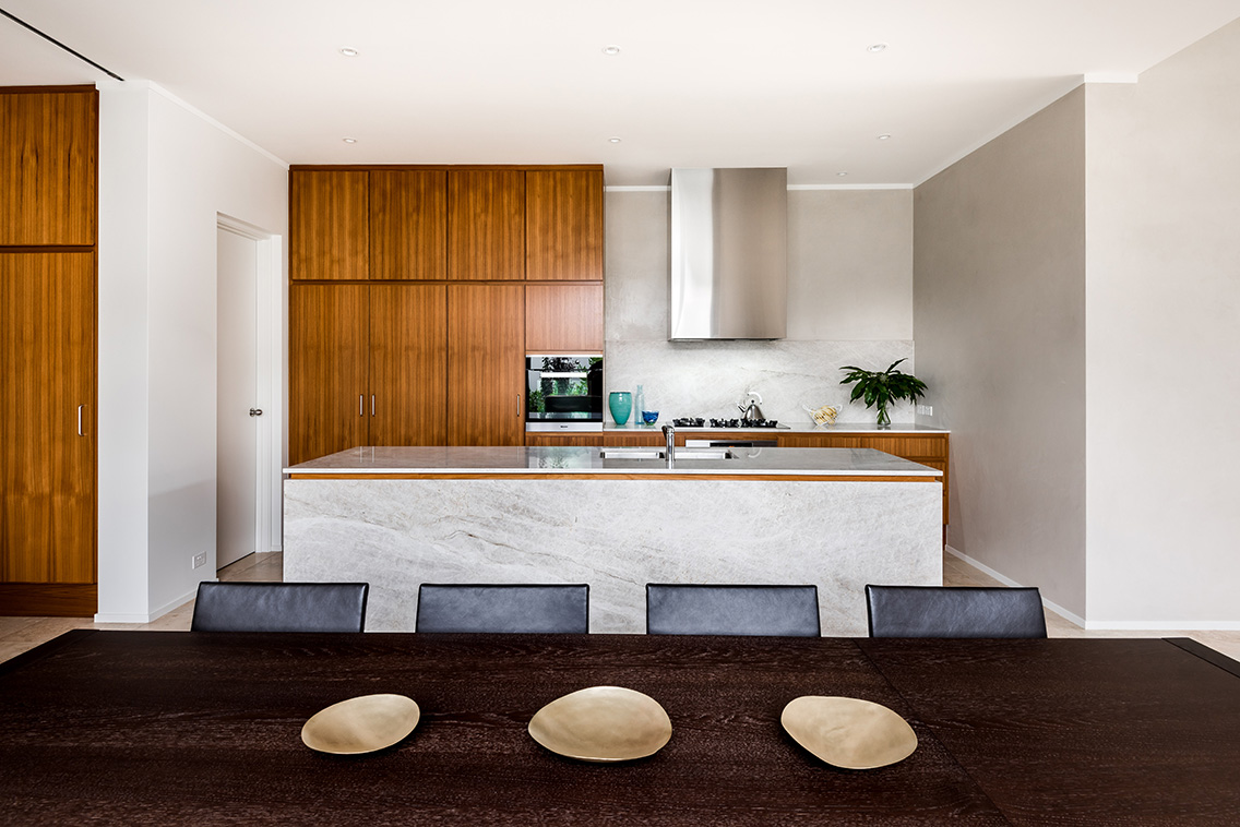
A recent visit to a furniture maker's home in the eastern suburbs, where a blend of workshop and living space is documented in detail, showed exactly how purple can hold its own against heavier materials. Jarrah shelving and concrete benchtops were paired with lilac upholstered stools and a single aubergine artwork, demonstrating how the colour can ground itself in robust, locally sourced materials.
Pairing purple with materials native to the West
The trend works particularly well when paired with materials that carry their own West Australian identity. Jarrah and marri timbers bring warmth that softens the coolness of lavender, while local limestone and granite introduce a mineral counterpoint that keeps richer purples from feeling heavy. Designers are also experimenting with rammed earth finishes in muted plums, drawing on regional architectural traditions and working within the energy efficiency provisions of the National Construction Code that govern window placement and thermal mass in new builds.
For homeowners keen to push further, pairing purple with the textures of native plants like banksia, grevillea and kangaroo paw in dried arrangements creates a layered, distinctly local feel. The broader Australian design scene has been moving toward this kind of material storytelling for several years now, and the current purple moment is reinforcing that shift by adding another chromatic dimension to it. Tiles made from recycled glass in lilac and plum tones are also emerging as a way to introduce the colour into wet areas without sacrificing durability in the face of Perth's hard water.
Practical tips for Perth homes
Bringing purple into a Perth home does not require a full renovation. The trend is at its most accessible when applied through soft furnishings and smaller decorative objects, items that can be swapped seasonally and updated without significant cost. Local stockists and makers, many of whom will be on show at this year's Contemporary Wine In Design event, are increasingly including the colour in their ranges.
A few practical pointers to consider:
- Test colours in natural light before committing, as Perth's intense sun can shift the appearance of paint and fabric significantly.
- Anchor the palette with a neutral base of warm whites, oat tones or soft greys to let the purple breathe.
- Mix textures rather than shades, combining velvet, linen, ceramic and glass in varying depths of the same colour family.
- Look to Australian-made textiles and ceramics to support local makers and ensure materials are suited to the WA climate.
- Consider the orientation of the room, deeper plums work beautifully in south-facing spaces that receive cooler light.
The colour also plays well with the public realm. Elizabeth Quay installations have leaned into a similar palette, offering an outdoor echo of what is happening inside Perth homes and reinforcing a sense of place that extends from the foreshore into private living rooms.
For anyone planning a refresh or a full renovation, the rise of purple accents is a reminder that Perth's design vocabulary is broadening. The coastal palette that defined the city's homes for a generation is now being inflected with something warmer, more contemplative and arguably more creative. Whether that means a single lilac cushion on a linen sofa or a fully tiled en suite in muted plum, the colour is finding its place in the Western Australian home, gently and without fuss.
Head to the Contemporary Wine In Design event to meet the makers, designers and architects shaping this shift, and to see how purple is being used across the state's most exciting new projects.