Australian-Made Wallpapers For Accent Walls And Feature Rooms
Wallpaper has returned to Australian interiors as a material with genuine architectural presence. Used across a full room, inside joinery, or on a single wall, it can alter perceived scale, soften acoustics and bring pattern into spaces that might otherwise rely on paint and furniture. The strongest Australian-made wallpapers also carry a sense of place, from botanical references to expressive geometrics and colour palettes suited to local light.
For Perth homes, compact Sydney apartments, Melbourne terraces and warm Brisbane interiors, choosing a wallcovering involves more than selecting a beautiful pattern. The paper needs to suit the room’s exposure, humidity, proportions and daily use. It is also worth distinguishing between Australian-designed wallpaper, locally printed products and paper manufactured entirely in Australia, as these labels describe different parts of the supply chain.
Why Wallpaper Works In Australian Homes
A feature wall is often treated as a decorative shortcut, yet wallpaper can perform several visual tasks at once. A vertical motif can make a low ceiling appear taller, while a mural or broad repeat can give a small dining room a stronger sense of depth. In open-plan homes, a patterned wall can establish a visual zone without adding a partition or blocking natural light.
Perth’s bright, directional sunlight makes colour especially important. Deep olive, rust, ink and ochre can look rich and grounded in a south-facing room, while pale mineral tones help prevent a west-facing wall from feeling overpowered in the afternoon. In Melbourne, where winter interiors often depend on warmer artificial lighting, dusty pinks, tobacco, moss and chalky blue can provide visual warmth without making a room feel heavy.
Wallpaper is also useful in rooms where paint can appear too flat. A linen-look surface, grasscloth effect or subtle textural print adds depth behind a bed, sofa or entry console. For an accent wall, the best result usually comes from coordinating the pattern with existing materials rather than matching every colour precisely. Timber, stone, brushed metal and upholstery can each pick up a minor tone from the design.
Australian Brands And Makers To Consider
Milton & King is one of the most recognisable Australian wallpaper names, with a broad catalogue of bold prints, murals, scenic designs and quieter patterns. Its collections make it relatively easy to move between maximalist interiors and restrained schemes. The brand is particularly useful when a project needs a large-scale image or a repeat that can carry a living room wall without additional artwork.
Signature Prints, associated with Melbourne’s creative and digital-printing scene, is another strong reference for custom and pattern-led wallcoverings. Digital production allows designers and homeowners to specify scale, colour and image treatment with more flexibility than traditional repeating paper. This can be valuable in a narrow hallway, powder room or commercial fit-out where a standard roll may not produce the right visual rhythm.
Australian-made should still be checked product by product. Some local studios design in Australia but manufacture offshore, while others use Australian printing or finishing for selected ranges. Look for clear information about the place of manufacture, substrate, paste requirements, fire rating and cleanability before ordering. A sample is essential because online colour can shift significantly between a screen and a sunlit Western Australian interior.
Useful Australian-Made Options
- Milton & King for murals, bold repeats and residential feature walls
- Signature Prints for digitally printed and customised designs
- Local artist collaborations for distinctive botanical or abstract work
- Small-batch studios for limited-run patterns and tailored colourways
The most successful choices often come from makers whose process is transparent. A locally produced wallcovering may offer shorter communication lines, easier sample requests and better access to technical advice. For architects and designers, that support can matter as much as the appearance of the print, especially when a project includes curved walls, high ceilings or multiple substrates.
Matching Pattern To Room And Orientation
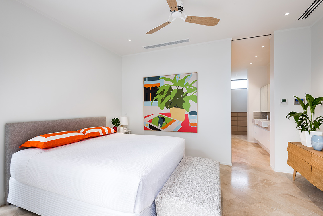
Bedrooms benefit from patterns that settle into the background after dark. Small-scale botanicals, hand-drawn marks and tonal stripes can create atmosphere without competing with bedding or artwork. A headboard wall is a natural location, but wrapping the paper around a corner can produce a more enveloping effect. In a guest room, a mural behind the bed can provide character while leaving the rest of the furnishings deliberately simple.
Dining rooms and powder rooms can accommodate greater intensity. A dark floral, architectural line drawing or oversized geometric pattern often feels more considered in a contained space than across an entire open-plan living area. In Australian homes, powder rooms are also an opportunity to use a paper that might be too assertive for a main bedroom, since visitors encounter it briefly and artificial lighting can heighten its colour.
Children’s rooms and playrooms need practical scrutiny. Vinyl-coated or wipeable surfaces may be more suitable than delicate paper, particularly around desks, bunks and craft areas. In coastal locations such as Fremantle or Newcastle, salt-laden air and open windows can add to general wear, while Queensland interiors may need careful attention to ventilation and moisture. Wallpaper should never be used to conceal active damp, rising moisture or a poorly prepared wall.
Pattern Pairings For Common Rooms
- Bedroom: soft botanical, narrow stripe or low-contrast abstract
- Dining room: large-scale foliage, mural scene or confident geometric
- Entry hall: vertical pattern, textured neutral or repeated linework
- Powder room: dark floral, saturated colour or highly detailed illustration
Scale deserves as much attention as colour. A small repeat may look busy on a broad wall, whereas a dramatic mural can lose impact when interrupted by windows and doors. Before installation, tape sample sheets to the wall and view them in morning, midday and evening light. This simple test is particularly useful in Perth, where the change between bright daylight and warm evening illumination can be pronounced.
Installation Details That Shape The Result
Professional installation is usually worth the expense. A wallpaper hanger can identify uneven plaster, manage pattern matching and set the first drop so the design reads correctly from the room’s main approach. In older terraces and renovated workers’ cottages, walls may be subtly out of square, making preparation even more important. A perfectly printed paper can look poorly resolved if the substrate has dents, old paint edges or visible joins.
The wall should be clean, dry and appropriately sealed. Some wallpapers are paste-the-wall products, while others require paste on the paper or a specific adhesive for heavier substrates. Always follow the manufacturer’s instructions, including recommended acclimatisation time. Rolls should generally be stored indoors before installation rather than left in a hot vehicle or exposed to a damp garage.
Australian commercial interiors may also require documentation for fire performance and cleaning. Hospitality venues, clinics, offices and retail spaces need to consider cleaning regimes, public access and wall protection in addition to visual impact. A product that works beautifully in a private study may not be suitable behind a café banquette or in a high-traffic hotel corridor.
For a high-quality residential project, allow for extra rolls to account for pattern matching, future repairs and unexpected cuts around power points or niches. Keep the batch number and a spare length in a labelled tube. This is a small practical step that can save considerable difficulty if a damaged section needs to be replaced years later.
Building A Room Around The Wallcovering
The wallcovering should be selected early enough to influence the wider material palette. Pull one or two secondary colours from the paper for curtains, upholstery, ceramics or painted joinery, then introduce contrasting textures to stop the room from becoming visually literal. A patterned wall usually benefits from quieter flooring and large furniture with clear silhouettes.
In a Perth renovation, for example, a eucalyptus-inspired print could sit comfortably with pale oak, travertine and woven linen. A Melbourne terrace might take a more layered approach, combining a dark geometric paper with stained timber, aged brass and a wool rug. For a Sydney apartment, where space is often limited, a reflective or pale-toned pattern can add interest without visually closing in the room.
The wider design context matters too. Homes that pursue passive solar principles, natural ventilation and lower-energy operation often use materials for sensory as well as technical reasons. A considered wallcovering can support that atmosphere through colour, pattern and tactility. One recent architect profile offers a useful reminder that interior finishes can participate in a broader environmental narrative rather than being treated as isolated decoration.
When the paper is part of a public-facing project, local networks can help with specification and discovery. Designers, makers and suppliers connected to the Australian industry are often accessible through exhibitions and professional gatherings; the Contemporary exhibitors directory is a useful place to encounter practices working across interiors, objects and architecture. These connections can lead to custom colourways, artist collaborations or a better understanding of how a product is made.
Making A Responsible Selection
A locally manufactured wallpaper is not automatically the most sustainable option, but proximity can reduce shipping distances and make supplier communication easier. The material itself matters as well. Ask about paper content, PVC coatings, inks, adhesive compatibility, packaging and whether the product can be removed without extensive damage to the wall. A durable product that remains attractive for many years may be preferable to a cheaper option replaced after a short trend cycle.
Pattern longevity is another form of responsible design. Rather than choosing a print solely because it is fashionable, consider whether its colour and scale will work with future furniture changes. Australian flora, abstract marks and architectural motifs can feel contemporary without being tied to a single season. Neutral does not have to mean plain; a softly textured surface or tonal linework can provide longevity while still giving a room a clear identity.
For rental properties, hospitality settings and staged homes, removable products may appear attractive, but their performance varies with wall paint, temperature and installation quality. Test a small area first and check the return conditions. For permanent homes, a traditional paper or robust non-woven substrate may provide a more convincing finish and better long-term value.
The ideal feature wall is therefore a balance of visual confidence, technical suitability and local relevance. Australian-made and Australian-designed options offer a rich starting point, whether the project calls for a dramatic mural, a quiet textural backdrop or a custom print that responds to the architecture. With careful sampling and professional preparation, wallpaper can give a room the depth and character of a much larger design intervention.
Choose a sample set that reflects your room’s orientation, existing materials and intended mood, then assess each design in real daylight before committing to full rolls. When the pattern, substrate and installation method are resolved together, an accent wall becomes more than a decorative surface: it becomes a precise, expressive part of the interior.