The Art of Layering Textures in Perth Living Rooms
A well-layered living room is felt before it is fully understood. Light moves across linen, timber softens against stone, and a rough ceramic vessel gives a polished surface somewhere to pause. The result is atmospheric rather than overly decorated: a room with depth, comfort and a clear sense of its occupants.
In Perth, texture has a particularly important role to play. The city’s bright sun, coastal air, dry summers and relaxed indoor-outdoor culture can make a room feel visually flat if every surface is smooth and pale. Tactile materials bring variation to contemporary interiors while helping a living space feel cooler, warmer, quieter or more grounded when the season changes.
Layering does not mean filling every corner with cushions and objects. It is a deliberate composition of finishes, fabrics, forms and tones. The strongest schemes often rely on a restrained palette, allowing differences in weave, grain, sheen and weight to create interest.
Begin with the room’s existing character
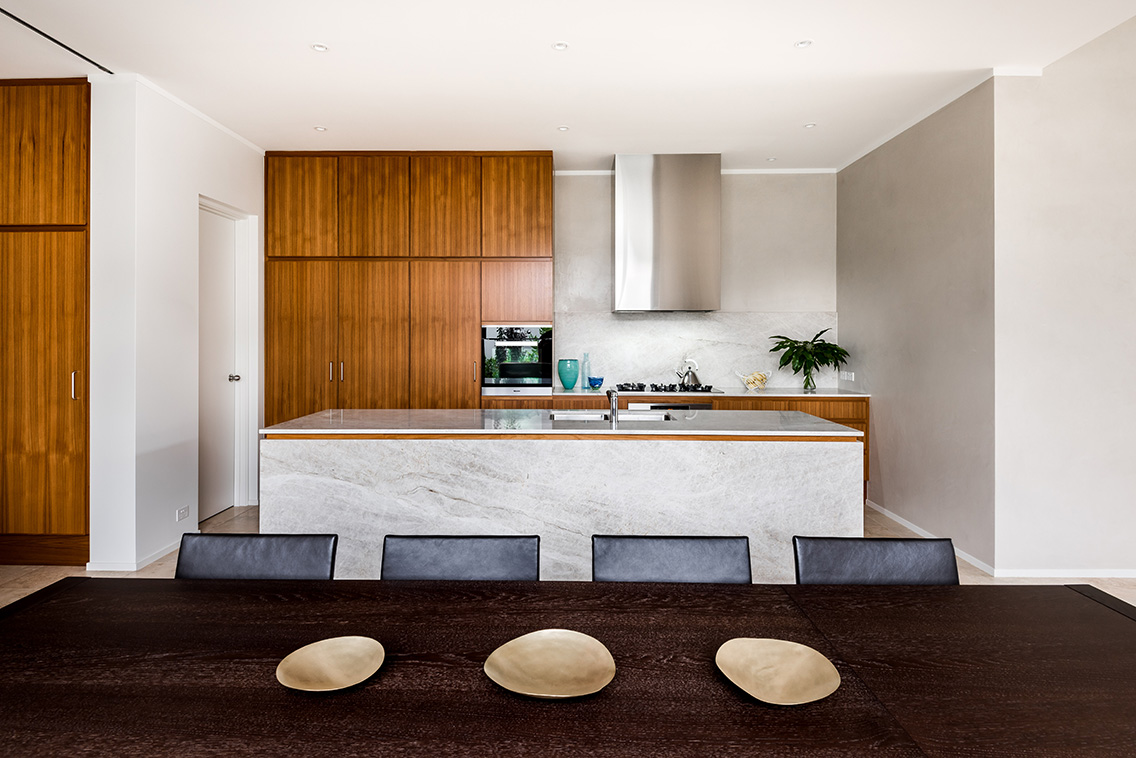
Before choosing a new rug or sofa, identify the textures already present. Perth homes may contain limestone, exposed brick, terrazzo, polished concrete, jarrah, painted masonry or large expanses of glass. These architectural elements should guide the interior palette rather than be treated as background.
A room with a cool concrete floor benefits from materials that introduce warmth and softness: wool, boucle, aged timber and brushed metals. In a heritage house with timber boards and ornate details, a collection of glossy lacquer, crisp cotton and smooth stone can provide a considered contrast. The aim is balance, not visual uniformity.
Natural light also affects how texture is perceived. Strong western sun can exaggerate shadows and highlight uneven surfaces, while filtered southern light may make pale fabrics appear grey or muted. Watch the room at different times of day before committing to large pieces. A fabric sample that seems understated in a showroom may become highly expressive beside a sunlit window.
For a broader view of how local designers respond to material, place and culture, the Wine in Design program offers a useful connection to Perth’s architecture and interiors community. It is a reminder that material choices are often tied to regional identity as much as visual style.
Build a tactile palette before a colour scheme
Colour is important, but texture can carry a room even when the palette is quiet. Start with three or four core materials and assign each a role. Timber might provide warmth, linen may bring softness, stone can add weight, and metal introduces a fine reflective note. From there, vary the surface quality within each category.
A successful neutral living room rarely uses a single beige. It combines chalky plaster, oat-coloured wool, sand-toned linen, honeyed timber and perhaps a darker leather accent. These shades may sit close together chromatically, yet their different finishes prevent the space from appearing washed out. Subtle tonal shifts are especially effective in apartments where the architecture needs visual calm.
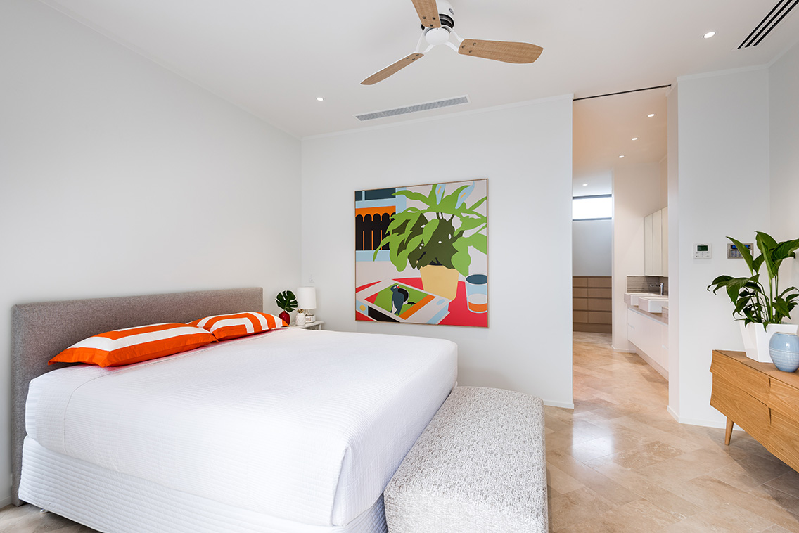
Contrast can also be created through touch. Pair a nubby upholstery with a smooth ceramic lamp, a loosely woven throw with a clean-lined coffee table, or a matte wall finish with a small polished object. Repetition keeps the mix coherent: repeat a timber tone in a side table and frame, or echo a rust colour in both an artwork and a cushion.
Keep the proportion of textures in mind. If every item is heavily woven, fringed or distressed, the eye has nowhere to rest. A tactile scheme needs quiet surfaces as much as expressive ones. Leave some negative space around the most textural pieces so they can register clearly.
Work with Perth light and climate
Perth’s climate encourages open windows, ceiling fans, generous glazing and a close relationship with courtyards or balconies. Living rooms should support that ease. Heavy synthetic fabrics and dense arrangements can feel oppressive during warmer months, while breathable materials help maintain a lighter atmosphere.
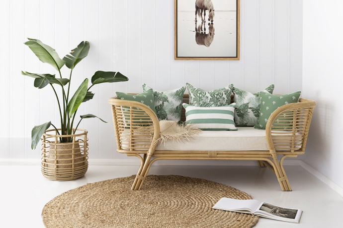
Linen, cotton, wool and rattan are useful starting points because they offer tactile variation without excessive visual weight. Wool rugs can provide insulation in winter and a soft foundation throughout the year. Linen curtains filter intense daylight and move gently with airflow, while timber furniture introduces a natural counterpoint to glass and white walls.
Sun exposure requires practical judgement. Place delicate textiles away from direct afternoon glare, or use lined curtains and adjustable blinds to protect them. Leather can age beautifully, but it should be positioned with care near hot windows. For high-use homes, select upholstery with a durable weave and removable covers where possible.
Indoor plants contribute another layer without adding clutter. Broad leaves contrast with woven baskets, while sculptural branches can animate a simple console. Choose species suited to the available light and ventilation, and use varied pot finishes—terracotta, stone, ceramic or timber—to build a quiet botanical composition.
Let large pieces establish weight
The sofa, rug and coffee table form the visual foundation of most living rooms. Their combined textures determine whether the space feels anchored or unsettled. Begin with the largest surface: a rug should relate to the room’s scale, sit beneath at least the front legs of the principal seating, and create a clear zone for conversation.
Flatweave rugs offer a crisp, architectural feel and work well beneath substantial furniture. A wool pile brings softness and acoustic comfort, while jute or sisal introduces a dry, organic quality suited to coastal and modern Australian interiors. If the floor already has strong grain or pattern, choose a rug with quieter texture rather than adding another dominant motif.
The sofa should provide a calm base. Boucle, brushed cotton and textured linen create softness, but their maintenance needs differ. In a family living room, a tightly woven fabric may be more useful than a delicate loose weave. A leather sofa can be balanced with wool cushions, a fabric ottoman and a thick rug to prevent the room from feeling too hard.
Coffee tables and occasional tables add structural contrast. A honed stone surface feels grounded and cool; timber brings warmth; glass preserves sightlines in a compact room. Combining two smaller tables in different heights can create a more relaxed arrangement than one oversized piece, especially when the materials share a colour or finish.
| Material | Sensory quality | Best use | Consideration |
|---|---|---|---|
| Linen | Airy, relaxed, softly crumpled | Curtains, cushions, upholstery | Can crease and fade in strong sun |
| Wool | Warm, resilient, naturally soft | Rugs, throws, occasional upholstery | Choose a tighter weave for busy areas |
| Timber | Warm, grounded, tactile | Tables, shelving, stools | Balance strong grain with quieter fabrics |
| Stone | Cool, weighty, mineral | Coffee tables, plinths, accessories | Honed finishes feel softer than high gloss |
| Rattan | Light, open and handcrafted | Chairs, baskets, pendant shades | Use selectively to avoid a themed look |
| Leather | Smooth, durable and rich | Sofas, ottomans, occasional chairs | Needs protection from heat and direct glare |
Use textiles to shift the mood
Textiles are the easiest way to adjust a living room without changing its architecture. Cushions, throws and curtains can make a space feel more generous, seasonal or personal. Instead of buying a matching set, combine different scales: one large plain cushion, a medium geometric or striped design, and a smaller piece with a pronounced weave.
Vary the hand of each textile. A soft washed linen can sit beside a crisp cotton canvas, a nubby wool and a smooth velvet accent. The combination works best when the colours are related. A palette of clay, cream, olive and charcoal can accommodate several patterns without becoming busy.
Throws should look available rather than perfectly arranged. Drape one over the arm of a sofa or fold it across an ottoman where it can be reached. In Perth’s cooler evenings, a lightweight wool or cotton throw adds practical comfort while introducing another horizontal line and layer.
Window treatments deserve the same consideration as cushions. Sheer curtains soften glare and add movement, while heavier side panels frame the view and improve acoustic comfort. Where privacy allows, keep the treatment simple so the room retains its connection to the garden, street or sky.
Give objects and art room to breathe
Small objects complete a layered interior, but they should be edited with care. Arrange books, ceramics, timber vessels, woven baskets and sculptural forms in groups of varied height. A low stack of books beside a tall vase creates rhythm; several objects of identical scale usually create visual noise.
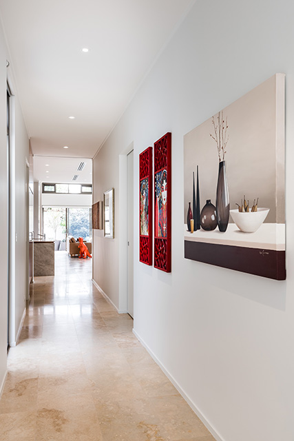
Art can act as both a textural and cultural anchor. A richly worked painting, fibre piece or hand-finished print introduces material depth while giving the room a point of focus. Consider how the artwork relates to the surface behind it: a delicate work may need a quiet wall, while a bold piece can hold its own against rough plaster or timber panelling.
The relationship between objects and local context is worth considering in Australian interiors. Western Australian makers often work with native timbers, clay, fibres, stone and pigments that carry a strong sense of place. Thoughtful collecting can bring that regional character into a home without relying on obvious coastal references. Contemporary’s feature on Indigenous art in public buildings offers valuable context for understanding how art, Country and architecture can meet with respect and intention.
Avoid placing every meaningful object together. Distribute pieces across shelves, side tables and walls so the room unfolds gradually. A single handmade bowl may have greater impact on an otherwise open console than a crowded display of decorative items.
A practical layering sequence
Approach the room in stages, allowing each layer to solve a different need. Start with comfort and scale, then add warmth, reflection and personality. This makes the process easier to edit and prevents texture from becoming a collection of unrelated purchases.
Use the following sequence as a flexible styling guide:
- Anchor the seating area with a correctly scaled rug in wool, flatweave, jute or another durable natural fibre.
- Add a sofa or armchair with a distinct but restrained upholstery texture, keeping the main silhouette visually simple.
- Introduce timber, stone or metal through tables and shelving to create contrast in weight and temperature.
- Layer textiles in related tones, mixing plain, patterned, smooth and nubby surfaces.
- Finish with art, books, plants and handmade objects, leaving clear areas of wall and tabletop for visual rest.
The final edit is as important as the first selection. Remove anything that repeats a texture too literally or competes with the room’s strongest material. Walk through the space from different angles, check how it works in daylight and evening light, and make sure pathways remain generous. A considered living room should invite movement as naturally as it invites lingering.
Texture is most convincing when it supports everyday life. A rug should withstand bare feet, a chair should be comfortable for long conversations, and a side table should hold a glass without becoming precious. Perth living rooms benefit from this relaxed practicality: refined materials, easy maintenance and a connection to the landscape beyond the glass.
Those interested in seeing how local studios, makers and designers approach material-led work can claim a free event pass to connect with the broader Perth design community. Bring that curiosity back home by noticing the surfaces, crafts and spatial ideas that make a room feel genuinely inhabited.
Layering textures is ultimately an exercise in attention. Look closely at the grain of a timber arm, the edge of a woven rug, the irregularity of a ceramic glaze and the way late sunlight changes a wall. Choose fewer materials with greater intention, allow contrast to create depth, and let the living room develop a character that feels distinctly connected to Perth.