A Perth Architect’s Home Makes the Case for Minimalist Living
In a quiet Perth street, an architect’s home offers a persuasive alternative to the idea that minimalism must feel severe. Its rooms are restrained but never cold, carefully composed yet comfortable enough for everyday life. Each surface, opening and object has a role, allowing the architecture to provide atmosphere without competing for attention.
The house is less a showcase of expensive finishes than a study in decisions. Natural light moves across limewashed walls, timber joinery gives warmth to the interiors, and concealed storage keeps the visual field calm. The result is a home that feels spacious because it is edited, not because it is oversized.
This approach reflects a broader Australian design sensibility: practical, climate-aware and closely connected to landscape. For readers following residential architecture, local makers and interiors across Western Australia, Contemporary’s design coverage provides a valuable context for understanding how considered homes are shaping the region’s visual culture.
The Quiet Logic Of Arrival
The experience begins before the front door. A low boundary wall, pale gravel and a narrow garden establish a measured transition from the street to the interior. There is no grand entrance or dramatic gesture. Instead, the threshold slows the body down and creates a sense of separation from Perth’s bright, active streetscape.
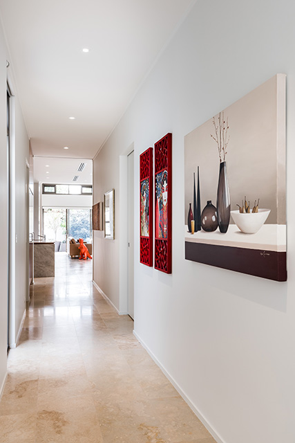
Inside, the entry is deliberately compact. A built-in bench, a timber hook rail and a single artwork provide everything needed without turning the space into a display zone. Shoes, bags and daily clutter have a designated place, so the first impression is one of order rather than emptiness.
This is an important distinction in minimalist interior design. The house does not remove signs of living; it gives them structure. A woven basket, a stack of books or a child’s drawing can remain visible because the surrounding architecture has enough discipline to absorb variation.
Materials That Carry The Room
The material palette is modest: warm oak, honed stone, hand-finished plaster and brushed metal. None of these finishes relies on a strong pattern or saturated colour. Their interest comes from grain, tactility and the way they respond to changing light.
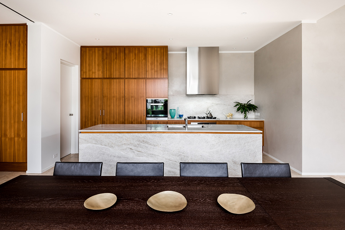
The kitchen demonstrates this restraint particularly well. Flat-fronted cabinetry runs across one wall, integrating appliances and pantry storage behind uninterrupted timber panels. A pale stone island provides a working surface, dining edge and informal meeting point, while its generous proportions prevent the room from feeling like a corridor of cupboards.
Throughout the home, junctions are treated as carefully as the materials themselves. Shadow gaps separate cabinetry from walls, recessed skirting boards reduce visual noise and door hardware is quietly integrated. These details are easy to miss individually, yet together they create the impression of a house that has been resolved from the inside out.
A Home Edited Around Light
Perth’s strong sunlight can make a poorly planned interior feel harsh, particularly when white surfaces and large areas of glass are used without moderation. Here, daylight is filtered through deep reveals, linen curtains and carefully positioned openings. Brightness is present, but it is softened and distributed rather than allowed to dominate.
The living room faces a planted courtyard, bringing greenery into the main sightline. A wide window frames the garden at seated eye level, making the exterior feel like part of the room. The planting is restrained as well: sculptural branches, native foliage and low-maintenance species provide texture without creating a busy backdrop.
At different times of day, the atmosphere changes almost imperceptibly. Morning light catches the grain of the timber floor; afternoon sun warms the plaster walls; in the evening, pools of low lighting replace the glare of the sun. This layered approach makes the home feel generous even when the palette remains quiet.
| Design element | Practical role | Atmospheric effect |
|---|---|---|
| Integrated timber storage | Conceals daily clutter | Creates warmth and visual continuity |
| Deep window reveals | Controls direct sunlight | Adds shadow and architectural depth |
| Courtyard planting | Extends the living area outdoors | Connects rooms to the Perth climate |
| Honed stone surfaces | Withstands frequent use | Introduces soft texture without pattern |
| Layered lighting | Supports different activities | Keeps the interiors calm after dark |
Living With Less, Not Without
The house makes a strong case for selective ownership. There are fewer freestanding pieces, but each one has been chosen for comfort, usefulness or emotional value. A low sofa anchors the living room, a vintage chair occupies a reading corner and a long dining table supports both weekday meals and larger gatherings.
This form of decluttering is not about achieving a blank interior. It is about removing objects that demand attention without contributing to daily life. Decorative pieces are grouped rather than scattered, giving them greater visual weight. A ceramic vessel made by a local potter may stand alone on a shelf, while a small collection of books is arranged where it can be reached and used.
The architect’s home also acknowledges that routines shape space. The laundry is positioned close to bedrooms, the study can be closed off during focused work, and circulation paths remain clear. Minimalism works here because it is based on behaviour. The layout supports the way the occupants actually live instead of imposing an image of perfection.
The Work Of Concealed Storage
Storage is one of the least glamorous subjects in residential design, yet it is central to the calmness of this home. Full-height joinery occupies otherwise awkward walls, using vertical space efficiently and keeping furniture to a minimum. Recessed niches hold everyday items without turning them into permanent visual features.
The most successful storage is distributed rather than concentrated in one oversized room. Kitchen equipment, linen, cleaning supplies and personal belongings are close to where they are needed. This reduces friction and prevents surfaces from becoming temporary holding areas.
Handles and hinges are kept discreet, but the storage is not difficult to use. Doors open easily, drawers are sized around their contents and internal fittings make the most of narrow compartments. The lesson is clear: a minimalist home depends on generous practical planning behind its quiet appearance.
Details That Age Well
A considered home should remain convincing after the first photographs are taken. In this project, longevity comes through proportion, repairable materials and flexibility. The rooms are large enough to accommodate changing furniture, while the neutral base can accept new artwork, textiles or objects without requiring a complete redesign.
The architect has avoided finishes that imitate luxury through shine. Instead, surfaces are allowed to become more expressive with use. Timber will deepen in colour, stone may develop a patina and plaster will record subtle variations in light and touch. These changes are treated as part of the home’s life rather than defects to be eliminated.
This attitude also extends to sustainability. Passive shading, cross-ventilation and a strong connection to the courtyard reduce reliance on mechanical systems. Durable materials limit the need for replacement, and restrained consumption leaves room in the budget for craftsmanship where it matters.
Principles Worth Taking Home
The interiors offer practical ideas for anyone considering a more pared-back home, whether renovating a small apartment or building a new house.
- Begin with circulation and storage before selecting decorative finishes.
- Choose a limited palette of durable materials with contrasting textures.
- Use openings, shading and planting to shape daylight rather than relying on artificial brightness.
- Keep objects that support daily rituals, carry memories or bring genuine pleasure.
- Allow rooms to remain flexible so the home can change with its occupants.
The most useful principle may be to edit slowly. Removing furniture or possessions can create immediate visual relief, but lasting simplicity comes from understanding why something belongs. The architect’s home feels personal because its restraint is selective, not automatic.
That selectivity is also what keeps the interiors from becoming generic. A handmade bowl, a well-used table or an artwork bought during travel introduces a layer of biography. These elements do not disrupt the minimalist composition; they complete it by showing who the space is for.
The home demonstrates that Australian minimalism can be warm, climate-responsive and deeply lived-in. Its beauty lies in the relationship between modest means and precise thinking: a window placed to catch a garden, a wall that conceals practical necessities, a material selected to age with dignity.
For Perth’s design community, this kind of residential architecture offers a grounded model of progress. It values local conditions over imported styles, daily comfort over spectacle and long-term use over fast visual impact. The house is quiet, but its ideas are substantial.
Explore the wider work of Western Australian architects, designers and makers through Contemporary, and look for the spaces where thoughtful restraint becomes a richer way to live.