From Shadow to Sunlight: Reworking a 1970s Family Home
When a young family bought this 1970s house, they saw more than low ceilings, dark timber, and a maze of enclosed rooms. Beneath the dated finishes was a generous suburban footprint, a mature garden, and the kind of solid construction that is increasingly difficult to find. The challenge was to reveal those qualities without erasing the character of the original home.
The transformation became an exercise in editing. Rather than treating the existing house as a blank canvas, the design team retained its strongest structural elements and reshaped the spaces around contemporary family life. Natural light, warm materials, practical storage, and a clearer relationship with the garden now define the interior.
For the owners, the project was also about creating a retreat from the speed of daily routines. School bags, shared meals, remote work, entertaining, and quiet weekends all needed a place within the plan. The result is a relaxed renovation that feels brighter and more spacious while remaining grounded in the home’s 1970s origins.
Reading the potential in a dark interior
The original house had many familiar features of its era: a compartmentalised plan, dark brickwork, timber-lined ceilings, and small openings between rooms. These details produced a sense of enclosure that might once have felt cosy, but no longer suited a family seeking visual connection and flexibility.
Instead of demolishing everything, the renovation began by identifying which elements could carry forward. The house’s broad floor plate, robust masonry, and established garden offered a strong foundation. Removing selected internal walls allowed daylight to travel deeper into the plan, while new openings created a sequence of views rather than a collection of isolated rooms.
This approach preserved a sense of permanence. The home does not pretend to be a newly built pavilion; its material weight and proportions remain legible. Contemporary interventions sit alongside the original structure, giving the renovation a layered quality that feels more personal than a complete stylistic reset.
Opening the plan to family life
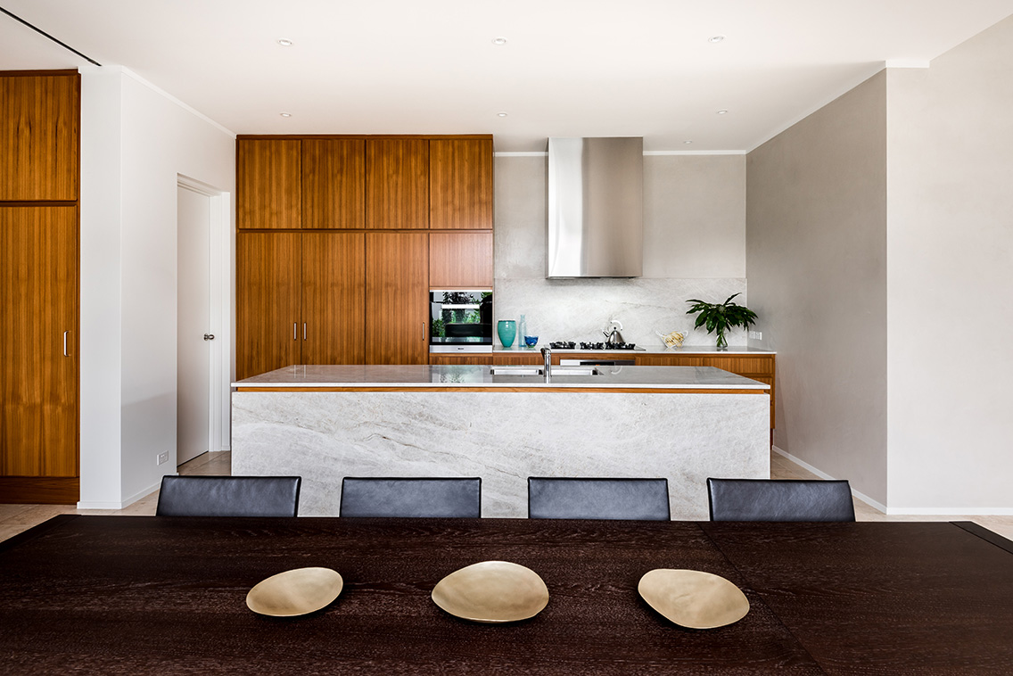
The central change was the reorganisation of the living areas. A former collection of small rooms became a connected kitchen, dining, and living zone, with each area retaining a distinct purpose. This arrangement supports togetherness without requiring every activity to happen in one undifferentiated space.
The kitchen now operates as the practical heart of the home. A generous island provides a place for breakfast, homework, food preparation, and conversation, while concealed storage keeps everyday clutter under control. Tall cabinetry is used sparingly, allowing the room to feel open rather than dominated by joinery.
Beyond the kitchen, the dining area establishes a visual link to the garden. Sliding doors extend the living space outdoors and make the backyard feel like an additional room. In Perth’s bright climate, this connection is especially valuable, though careful shading and glazing choices help manage heat during summer.
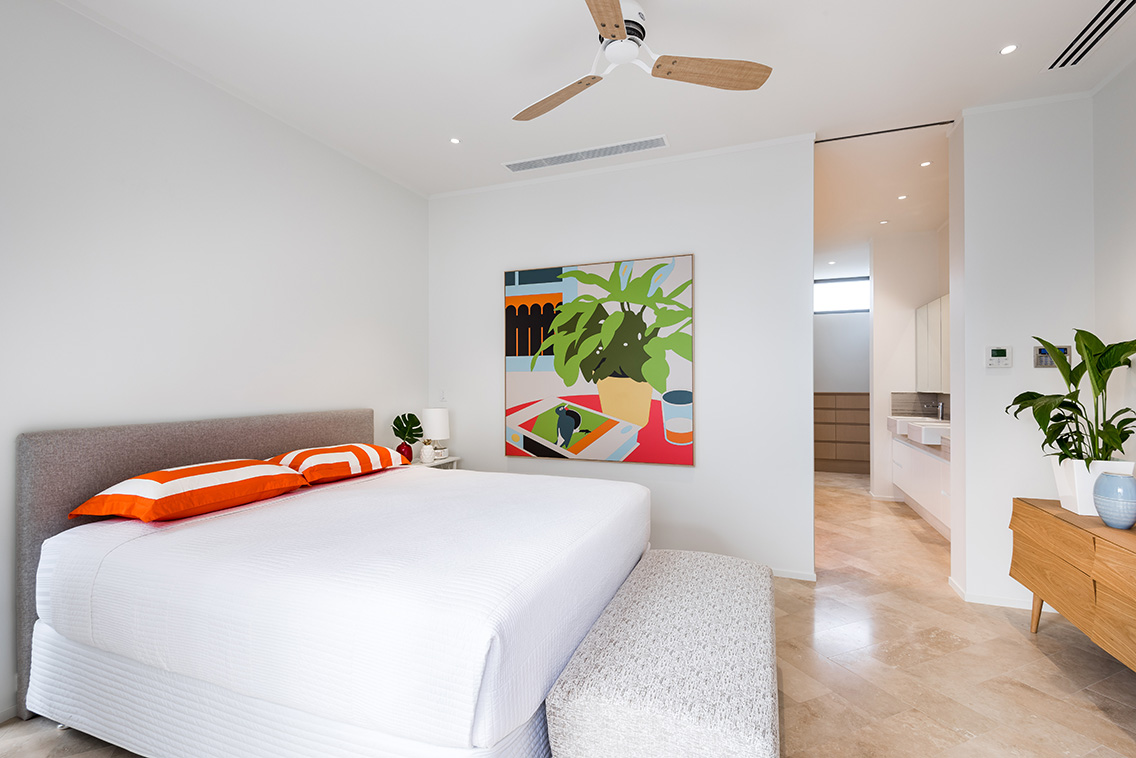
The family’s private rooms remain more contained. Bedrooms are positioned as quieter retreats, with softened finishes and built-in storage that supports a calm atmosphere. This balance between communal openness and personal refuge gives the house flexibility as the children grow.
Bringing daylight deeper into the house
Light became the project’s most important material. The renovation uses several modest interventions rather than relying on one dramatic gesture. Wider openings, borrowed light through internal glazing, pale wall finishes, and reflective surfaces work together to distribute brightness across the plan.
Existing windows were assessed for their orientation and relationship to the garden. In some areas, openings were enlarged to frame trees and bring in morning light. In others, the design uses carefully positioned skylights or clerestory glazing to brighten circulation zones that previously felt heavy and compressed.
The palette supports this change without becoming stark. Warm whites, muted mineral tones, and natural timber create a soft background for sunlight to shift throughout the day. Textured surfaces, including honed stone and tactile fabrics, prevent the lighter scheme from feeling flat or overly polished.
Window treatments are equally important. Sheer curtains filter glare and preserve privacy, while heavier curtains provide insulation and intimacy at night. The result is a house that feels luminous rather than simply white, with changing shadows adding depth to the rooms.
Choosing materials for warmth and resilience
A family home must withstand spills, sand, wet shoes, toys, and constant movement. The renovation therefore combines refined detailing with surfaces that can age well. Stone is used in high-contact areas, timber brings warmth underfoot, and durable upholstery keeps the living spaces welcoming rather than precious.
The flooring strategy was central to the new sense of continuity. A timber floor runs through the main living areas, visually linking the kitchen, dining room, and lounge. Its natural variation adds character while helping the open plan feel cohesive. For projects in coastal or humid conditions, the practical details matter, and guidance on French oak flooring can help clarify decisions around species, finish, installation, and seasonal movement.
Joinery was designed to disappear where possible. Integrated appliances, flush panels, and full-height cupboards create a clean outline, while selected open shelves allow books, ceramics, and family objects to remain visible. This combination gives the interiors a lived-in quality without allowing visual noise to take over.
Metalwork and lighting provide quieter points of contrast. Brushed finishes, sculptural pendants, and wall lights introduce detail at eye level, reinforcing the idea that a restrained palette can still be rich and expressive.
| Design move | Effect on the home | Family benefit |
|---|---|---|
| Removing selected internal walls | Creates longer sightlines and better daylight distribution | Makes supervision and shared activity easier |
| Connecting living areas to the garden | Extends the usable footprint outdoors | Supports entertaining and informal play |
| Using pale, warm finishes | Reflects natural light without a clinical feel | Creates a calm everyday backdrop |
| Integrating generous storage | Reduces visible clutter | Keeps high-traffic areas functional |
| Retaining selected original elements | Preserves the home’s character and material depth | Gives the renovation a sense of continuity |
Making the garden part of the architecture
The backyard was treated as a design asset rather than a view to be framed after the fact. Existing trees helped establish privacy and shade, while new planting softened the edges of the building. From inside, foliage now appears at several distances, creating visual depth beyond the relatively compact rooms.
The threshold between indoors and outdoors was carefully considered. Level transitions were minimised where practical, and the paving aligns with the internal floor direction to strengthen the sense of extension. Outdoor furniture is positioned close to the living spaces, making the terrace useful for ordinary meals rather than reserved for special occasions.
This connection also changes how the house is experienced across the seasons. In summer, doors can open early in the morning before the heat builds. During cooler months, the garden remains present through glazing, while the interior becomes a more sheltered place for family gatherings.
The approach reflects a broader Australian design sensibility: a home should respond to climate and landscape while supporting informal living. Here, the garden is not decorative scenery. It is part of the family’s daily routine and a source of calm within the busy suburban setting.
Details that make the renovation feel personal
A successful renovation is measured through its small decisions as much as its broad gestures. In this house, built-in benches create useful places to pause, niches give everyday objects a home, and rounded edges soften the transition between architectural volumes. These details add comfort without competing for attention.
Colour is introduced with restraint. A muted green in a bathroom, a clay-toned textile in the living area, or a deep timber note in the entry can make the lighter rooms feel more grounded. Rather than applying a single neutral scheme everywhere, the design allows each zone to carry a slightly different mood.
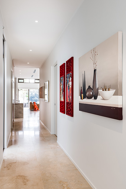
Art and objects are given room to breathe. The owners’ collection of books, ceramics, and collected pieces adds personality to the new interiors, ensuring the home does not read as a staged display. Against the pale walls, these possessions become part of the architecture’s visual rhythm.
The completed renovation also demonstrates the value of patience. Some of the most effective changes are invisible once the work is finished: improved circulation, better storage, more useful door positions, and lighting that supports different times of day. The house feels effortless because the difficult decisions have already been resolved.
Designing for a home that can evolve
Young families rarely inhabit a house in a fixed way. Needs shift quickly, from prams and play mats to study zones, sports equipment, and visiting friends. This renovation anticipates those changes through adaptable rooms and joinery that can absorb new demands.
The open living area is spacious enough for different activities to overlap, while the quieter rooms can change function over time. A guest room may become a study, a playroom may become a teenager’s retreat, and a broad landing may eventually support independent reading or creative work.
Storage remains one of the most important long-term investments. Instead of pushing cupboards into every available corner, the design concentrates storage where it is most useful: near the entry, around the kitchen, and within the bedrooms. This leaves the main rooms visually calm while keeping everyday necessities accessible.
A renovation of this kind shows that lightness is not achieved through decoration alone. It comes from understanding movement, orientation, proportion, and the emotional role of materials. The house is brighter because it is better organised, and more restful because its practical demands have been considered from the beginning.
What this transformation gets right
- It preserves the solid character and useful proportions of the original 1970s house.
- It opens selected rooms rather than removing every sense of separation.
- It treats natural light as a planning tool, not a finishing touch.
- It combines durable materials with a warm, tactile residential palette.
- It allows the garden, storage, and future family needs to shape the design.
The renewed home offers a persuasive model for suburban adaptation. Its success does not depend on spectacle or excess. Instead, it comes from carefully aligning the structure with the way a young family actually lives: together but not always in the same room, connected to the outdoors, surrounded by meaningful objects, and supported by spaces that can change.
For more local design stories, project photography, and conversations across the Australian architecture and interiors community, explore That’s a wrap and keep following the work shaping contemporary Western Australian homes.