From Dimmed 1980s Kitchen to Light-Filled Living Space
A kitchen renovation can change far more than the room where meals are prepared. In a Perth home shaped by the conventions of the 1980s, the removal of dark cabinetry, enclosed partitions, and heavy finishes created a brighter interior with a stronger connection to the rest of the house. The result is a useful study in how thoughtful planning can make an older home feel generous without stripping away its character.
The project began with familiar problems: limited daylight, awkward circulation, dated materials, and a kitchen that separated cooking from everyday family life. Rather than treating the existing structure as an obstacle, the renovation team identified which elements could be retained, softened, or opened to support a more contemporary way of living.
This balance between practical change and architectural restraint is central to the design stories shared by Contemporary, where residential interiors sit alongside Australian architecture, product design, and the people shaping the built environment.
Reading The Existing Home
The original kitchen carried the visual weight of its era. Dark timber-look cabinetry absorbed the available light, while glossy laminate surfaces and a patterned tiled floor made the compact room feel busier than it was. A low ceiling and enclosed doorway further reduced the sense of space, creating a series of visual stops between the kitchen, dining area, and living room.
Its shortcomings were functional as well as aesthetic. Preparation space was fragmented across several corners, storage was difficult to access, and the sink faced a wall rather than the garden. The kitchen supported a narrow set of tasks, but it did not accommodate the overlapping activities that define contemporary domestic life: cooking, working, entertaining, and keeping an eye on children.
The renovation therefore focused on relationships rather than isolated finishes. The designers mapped movement through the ground floor, studied the direction of natural light, and considered where a new opening could provide the greatest benefit. This approach prevented the project from becoming a simple cosmetic update.
Opening The Plan
The most important intervention was the removal of a partial wall between the kitchen and dining zone. The change did not create a completely unrestricted open-plan interior; instead, it established a wider threshold that allowed light and sightlines to pass between rooms. A structural beam was integrated into the ceiling so the transition felt deliberate rather than like a trace of demolition.
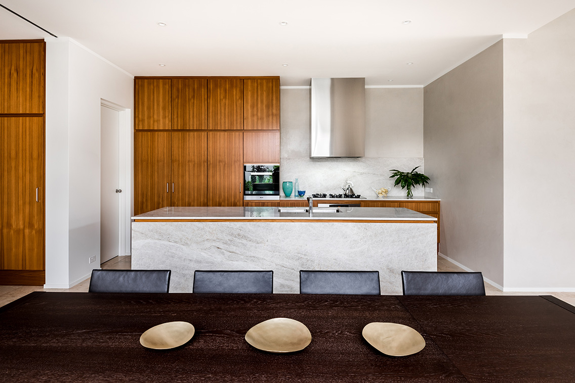
A new island became the centre of the room. Its broad benchtop provides space for preparation and informal meals, while its orientation directs attention towards the living area and rear garden. The island also replaces the old division between kitchen and dining, giving the household a place to gather without blocking circulation.
The layout now follows a simple sequence: tall storage and appliances occupy the least prominent wall, low cabinetry runs beneath the windows, and the island anchors the middle of the room. This arrangement keeps the central floor area clear and makes the kitchen feel larger without increasing its footprint.
Letting Daylight Lead
Colour was treated as an architectural tool rather than a decorative afterthought. Warm white walls, pale oak joinery, and a lightly veined stone surface reflect daylight across the room. These materials introduce softness and texture while avoiding the starkness that can result from an all-white interior.
The window above the sink was enlarged within the limits of the existing facade. A slim frame maximises the view to the garden, where filtered planting provides a changing backdrop throughout the day. Under-cabinet lighting supports evening tasks, while concealed illumination above the tall joinery adds a gentle wash to the ceiling.
The brightness comes from a combination of decisions rather than a single dramatic gesture. Reflective surfaces, open shelving, restrained hardware, and carefully positioned lights all contribute to the feeling that the kitchen has gained volume. The design demonstrates how an older home can be made lighter through proportion and material selection, even when major extensions are not possible.
A Material Palette With Restraint
The new interior avoids reproducing the period details of the original kitchen, yet it does not feel disconnected from the wider house. Oak-toned cabinetry references the warmth of the existing timber floors, while brushed metal handles introduce a quiet contemporary note. The benchtop has a subtle stone pattern that adds movement without competing with the garden view.
Joinery was planned around the realities of storage. Deep drawers hold cookware and serving pieces, narrow internal compartments organise trays and chopping boards, and a dedicated pantry conceals small appliances. By assigning a clear role to each cabinet, the kitchen remains visually calm during everyday use.
The flooring was replaced with wide timber boards in a low-sheen finish. Their longer lines draw the eye towards the open living area and help unify the connected rooms. This continuity is essential to the success of the renovation: the kitchen feels brighter because it belongs to a larger composition rather than operating as an isolated white box.
| Design Element | Original Condition | Renovated Response | Effect On The Space |
|---|---|---|---|
| Kitchen layout | Enclosed and difficult to navigate | Partial wall removed and circulation widened | Stronger connection to dining and living |
| Cabinetry | Dark, visually heavy laminate | Pale timber-toned joinery with integrated storage | Greater light reflection and visual calm |
| Work surface | Limited benches across separate areas | Central island with generous preparation space | Better workflow and informal gathering |
| Window | Small opening facing a wall | Enlarged window oriented towards the garden | Improved daylight and outlook |
| Lighting | Single central fitting | Layered ceiling, task, and concealed lighting | More flexible use from morning to evening |
| Flooring | Patterned tiles that divided the room | Continuous wide timber boards | Stronger sense of flow across the ground floor |
Designing For Everyday Patterns
The renovation succeeds because it responds to ordinary habits. The island can serve breakfast before school, a laptop during the working day, and a surface for shared preparation when guests arrive. Electrical outlets are discreetly positioned for appliances and charging, while the main work zones remain free from unnecessary visual clutter.
The sink’s new position beside the garden window improves both comfort and outlook. Washing up is no longer a task performed towards a blank wall, and the window helps connect the most frequently used part of the kitchen to the seasons outside. A concealed rangehood maintains clean lines above the induction cooktop without dominating the room.
Acoustics were also considered. Soft furnishings in the adjoining dining area, timber surfaces, and a textured runner reduce the hard echo often associated with open-plan interiors. The result is a room that feels sociable but still supports concentration and quiet routines.
This attention to use reflects a wider movement in Australian residential design, where kitchens are increasingly planned as adaptable living spaces rather than dedicated service rooms. The best examples understand that flexibility depends on details: generous clearances, accessible storage, resilient finishes, and lighting that can shift with the household.
Lessons For A Sensitive Renovation
The project offers several practical principles for homeowners working with a dated kitchen. The first is to prioritise spatial relationships before choosing finishes. A beautiful benchtop cannot solve a circulation problem, but a carefully positioned opening can improve the entire ground floor.
The second is to use contrast with care. The renovated kitchen is brighter because darker elements were reduced, not because every surface was made brilliant white. Warm timber, muted metal, and softly patterned stone provide depth and prevent the room from feeling clinical.
The third is to make storage part of the architecture. Tall cabinetry aligns with the wall, appliances disappear behind consistent fronts, and open shelving is limited to objects that add usefulness or character. This creates a composed backdrop for daily life while preserving easy access to essential items.
The same principle applies beyond private interiors. In a recent example of design supporting public life, a shaded Elizabeth Quay installation combines artwork with seating and shelter, showing how thoughtful spatial decisions can influence the way people gather and move. In both settings, design becomes most effective when it responds to behaviour.
Decisions Worth Making Early
A successful kitchen transformation depends on a clear brief. Before demolition begins, homeowners and designers should agree on how the room needs to perform, which visual elements belong to the existing house, and where the budget should have the greatest impact.
Useful priorities include:
- Measure circulation routes and allow comfortable clearance around the island, doors, and appliances.
- Identify the best source of natural light before deciding whether to enlarge windows or remove partitions.
- Plan storage around actual cookware, appliances, groceries, and household routines.
- Select a restrained palette of durable materials that relates to adjoining rooms.
- Layer ambient, task, and accent lighting so the kitchen works throughout the day.
These decisions also help control scope. Moving plumbing, altering structural walls, or upgrading electrical systems can have a substantial effect on cost, so each change should be assessed against the improvement it brings. In this renovation, the strongest gains came from a small number of coordinated moves rather than a collection of expensive gestures.
The final space feels contemporary because it is open, luminous, and adaptable, but its success is rooted in careful observation of the existing home. The dark 1980s kitchen was not simply replaced; it was reinterpreted through better light, clearer movement, and a stronger relationship with the rooms around it.
For homeowners, designers, and students of residential architecture, the project is a reminder that renovation can be transformative without being excessive. Reconsider the plan, reveal the daylight, and let each material support the way the room is lived in. Follow more considered Australian design stories through Contemporary and carry these principles into the next space you shape.