Layering texture in a coastal living room: lessons from Cottesloe
A coastal living room rarely succeeds through a single visual gesture. Pale walls, linen upholstery and a few pieces of driftwood may suggest the shoreline, but they do not necessarily create a space that feels settled, generous or connected to its location. The most convincing interiors build atmosphere through touch, contrast and carefully controlled variation.
A Cottesloe project offers a useful lesson in this approach. Its coastal character is not treated as a theme to be applied through obvious nautical references. Instead, the room draws from Western Australia’s beachside conditions: strong sunlight, chalky sand, weathered timber, mineral colours and the relaxed rhythm of indoor-outdoor living.
Texture is especially important in a room with a restrained palette. When colour is quiet, surfaces carry the visual energy. A rough stone finish can sharpen the softness of a boucle chair, while a sheer curtain can temper the hardness of a timber floor. The result is an interior that feels calm without becoming flat.
Start with the coastal light
Natural light should guide the textural scheme from the beginning. Cottesloe homes often benefit from bright coastal conditions, but intense afternoon sun can make a room feel glaring if every surface is smooth and reflective. Layering absorbent and diffused materials helps distribute that light more gently.
Begin with a soft foundation. Limewashed walls, matte paint, honed plaster or subtly brushed finishes can provide a quiet backdrop that changes throughout the day. These surfaces catch light without producing the sharp reflections associated with polished stone or high-gloss joinery. A warm white, sandy beige or muted grey-green will usually feel more connected to the landscape than a stark, blue-toned white.
Window treatments are equally influential. Full-height linen curtains soften the view and create movement when the sea breeze enters the room. Where privacy permits, a translucent roller blind can sit behind them, allowing the space to remain bright while reducing glare. The combination is more useful than relying on heavy curtains, which can make a coastal room feel visually sealed.
Build a tactile base
The floor establishes the first layer of physical warmth. Timber, limestone, terrazzo and woven rugs can all work in a coastal living area, but their finish matters as much as their material. Highly polished surfaces tend to make a room feel formal, while brushed, honed or lightly textured finishes sit more naturally within a relaxed beachside setting.
In the Cottesloe example, the most effective approach is to let the floor provide a grounded, slightly imperfect counterpoint to lighter furniture. A pale oak with visible grain, a honed limestone tile or a wool rug with a low irregular pile can create this effect. Texture does not need to be dramatic; small variations in grain and softness are often enough to prevent a neutral room from feeling sterile.
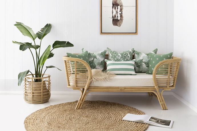
Area rugs should be selected for both touch and proportion. A large wool, jute or cotton rug can connect separate seating pieces and define the living zone within an open-plan space. Jute brings a dry, fibrous quality that recalls dune grass, while wool adds density and acoustic comfort. If using a coarse natural fibre, balance it with a softer layer nearby, such as a cotton throw or upholstered ottoman.
Balance hard and soft materials
The central discipline of texture layering is contrast. A room composed entirely of soft fabrics can appear heavy and indistinct, while one dominated by stone, glass and timber may feel cold. The most resolved coastal interiors place opposing materials close enough to make each other legible.
Consider pairing a substantial linen sofa with a travertine side table, or a rounded boucle chair with a slender timber stool. A ribbed ceramic lamp can sit beside a smooth plaster wall; a woven pendant can hang above a honed stone coffee table. Each object gains presence because its neighbour offers a different tactile experience.
The contrast should remain controlled. Too many strong textures compete for attention, particularly in a compact living room. Choose one or two materials to carry visual weight and allow the rest to support them. In a Cottesloe setting, this might mean using limestone and timber as the harder elements, then introducing linen, wool and woven fibres in quieter proportions.
| Material | Sensory quality | Useful placement | Coastal effect |
|---|---|---|---|
| Linen | Dry, soft and gently creased | Sofas, curtains and cushions | Relaxed and breathable |
| Honed limestone | Cool, matte and subtly varied | Coffee tables, floors or hearths | Mineral and grounded |
| Light timber | Warm, tactile and directional | Joinery, stools or shelving | Connects to sand and coastal vegetation |
| Wool | Dense, soft and acoustically absorbent | Rugs, throws and occasional upholstery | Adds comfort and depth |
| Woven fibre | Textured, open and handcrafted | Pendant lights, baskets or occasional chairs | Introduces a natural, informal note |
Use repetition instead of matching
A coherent room does not require every texture to be repeated in the same form. Repetition is more sophisticated when it occurs through related qualities. The grain of timber might reappear in a woven basket, the warmth of a tan leather detail or the linear pattern of a ribbed ceramic vessel.
This creates a visual conversation across the room. A coarse rug can echo the irregularity of a limestone surface, while the pale tone of both materials keeps the relationship understated. Similarly, several natural fabrics in slightly different shades can establish continuity without producing a showroom-like matching set.
The Cottesloe project demonstrates why tonal variation is valuable. Sand, chalk, shell, dune grass and weathered grey can sit within the same palette, provided their undertones are compatible. Instead of selecting one beige for every surface, move between warm ivory, muted taupe, soft stone and desaturated olive. The small shifts give the room depth while preserving its coastal restraint.
Handmade objects are particularly useful here. A vessel with a slightly uneven glaze, a timber bowl with visible tool marks or a woven container with an irregular edge can introduce evidence of the hand. These details stop the room from feeling overly resolved and help connect a contemporary interior to the craft traditions of the Australian design scene. For broader local context, a Perth case study shows how material decisions can support light, proportion and everyday living in a Western Australian home.
Introduce depth through upholstery
Upholstery is where a coastal living room becomes genuinely comfortable. The safest approach is not to use one fabric everywhere, but to give each seating piece a distinct role. A relaxed linen sofa can act as the visual anchor, while a heavier cotton, wool or textured weave provides variation on an armchair or ottoman.
Cushions should be mixed by scale and surface rather than collected as a series of decorative motifs. Combine a washed linen square with a smaller nubby weave, a fine stripe or a cushion with a subtle slub. A single deeper tone—such as tobacco, seaweed green or weathered navy—can add definition without shifting the room into a nautical scheme.
Throws are most effective when they appear usable rather than carefully arranged. Drape one over the arm of a chair or fold it loosely across the sofa so its fringe, weave or creased edge becomes part of the composition. In a family home, performance fabrics and removable covers may be practical choices, but they should still retain a natural visual quality. Easy maintenance need not result in synthetic-looking surfaces.
Keep the palette close to nature
Colour and texture work together. A pale palette can reveal subtle differences between materials, while darker or more saturated tones often make texture feel stronger. The coastal living room in Cottesloe benefits from a restrained base because it allows the tactile qualities of timber, stone and fabric to remain visible.
Use the landscape as a reference rather than a literal colour chart. The grey of a limestone outcrop, the green of coastal shrubs, the warm beige of sand and the softened blue of distant water can be interpreted through finishes and furnishings. Avoid using all of these notes at equal intensity. A dominant neutral, a supporting earthy tone and one restrained accent are usually sufficient.
Metal can add a useful fourth dimension when handled carefully. Aged brass, darkened bronze or softly brushed stainless steel brings a cooler, finer texture to a scheme dominated by organic materials. Glossy chrome may feel too sharp, while black metal can create unnecessary graphic contrast. Select hardware and lighting with the same attention given to upholstery and flooring.
Edit the details for a lived-in finish
The final layer comes from objects, artwork and the spaces left empty. Coastal styling can become predictable when every surface holds a shell, coral form, blue vase or beach photograph. A more enduring room suggests its location through material and light, then leaves room for personal history.
Choose a small number of objects with distinct tactile qualities. A rough ceramic bowl, a carved timber sculpture, a linen-bound book and a stone tray can provide enough detail for a console or coffee table. Vary their height and silhouette, but keep the composition open. Negative space allows each object to be read and prevents the room from becoming visually busy.
Art should deepen the atmosphere rather than explain it. Abstract works with mineral colours, photographs of local landscapes or pieces by Australian makers can connect the living room to its setting without resorting to literal seaside imagery. The wider design community is part of this conversation, and meeting local practitioners through the Contemporary ambassadors network can offer valuable insight into materials, craft and place.
A practical texture checklist
- Establish a matte, light-reflective base through plaster, limewash, timber or honed stone.
- Combine at least three tactile families, such as woven fibre, natural wood and soft upholstery.
- Balance rough materials with smooth or gently rounded surfaces.
- Repeat colours and material qualities subtly instead of matching every item.
- Leave clear areas between objects so the room retains a sense of air and movement.
A successful coastal living room is ultimately less about decoration than calibration. Every surface contributes to how the room looks in sunlight, sounds when occupied and feels underhand. The Cottesloe project shows that coastal character can be quiet, contemporary and distinctly local when it is built through considered layers rather than a collection of familiar motifs.
For designers, homeowners and students, the most useful exercise is to assess a room by touch as well as sight. Notice where the space feels too hard, too uniform or overly reflective, then introduce one contrasting material at a time. To continue the conversation around Western Australian architecture, interiors and creative practice, join the next design gathering and experience how local ideas take shape beyond the page.