The Artwork That Shaped an Entire Perth Home
In a Perth house defined by warm light, pale timber and long views to the garden, the interior palette began with a single artwork. Rather than selecting finishes room by room, the local designer treated the painting as a visual map: its mineral reds became upholstery, its softened blue appeared in joinery, and its dark marks established a rhythm for metalwork and lighting.
This approach gave the home a sense of continuity without making every space feel matched. Colour travels through the rooms in measured shifts, while texture and proportion keep the scheme grounded. The result is a house that feels collected rather than decorated, with the artwork continuing to influence the architecture long after its frame has been hung.
The strategy is especially relevant to Australian interiors, where strong daylight can exaggerate colour and local materials often carry their own distinctive tones. A carefully chosen reference point can bring these elements together, creating a residential design that responds to place as much as it responds to personal taste.
Beginning With A Visual Anchor
The artwork is a large abstract composition by an Australian painter, built from chalky neutrals, eucalyptus green, rust, ink and a restrained flash of cobalt. Its surface shifts between dense pigment and exposed ground, giving the designer several layers to interpret. The palette was not copied literally. Instead, the tonal relationships within the work became the foundation for the interiors.
That distinction matters. A direct colour match can make a home feel overly coordinated, while a more considered reading allows a hue to change character from one material to another. The rust in the painting appears as a muted terracotta on a linen chair, the green becomes a deep olive on cabinetry, and the blue is reserved for smaller moments where it can retain its intensity.
The designer also paid attention to the artwork’s visual weight. Its dark gestures were balanced by substantial timber, stone and woven fibres, preventing the painting from becoming an isolated statement. The piece belongs to the room because the room has been given enough material depth to meet it.
Translating Colour Into Materials
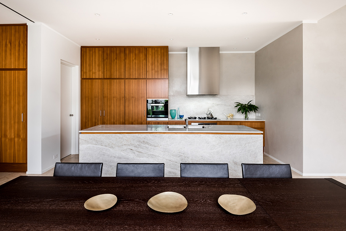
Material selection was the next stage in developing the interior colour story. A honed limestone floor establishes a soft, sandy base, while American oak cabinetry introduces a golden warmth that changes throughout the day. These quiet surfaces allow the stronger colours to appear with clarity instead of competing for attention.
In the kitchen, the green drawn from the artwork is used on the island cabinetry. Its low-sheen finish absorbs light and gives the joinery a furniture-like quality. Behind it, a pale stone splashback contains fine veins of grey and ochre, linking the cabinetry to the artwork without repeating its composition.
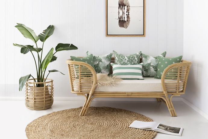
The living room takes a gentler approach. A rust-toned armchair sits beside a natural wool rug, and a pair of cushions carries the blue accent into the seating arrangement. These details are deliberately separated. The eye discovers them gradually as it moves through the space, which makes the palette feel layered rather than prescribed.
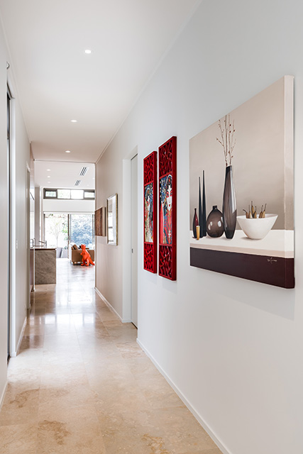
In the hallway, the designer used dark timber and aged bronze to interpret the painting’s strongest marks. This creates a visual pause between the brighter living areas and the bedrooms. The darker passage is less about adding drama than about giving the lighter rooms somewhere to lead.
| Artwork Element | Interior Translation | Effect In The Home |
|---|---|---|
| Chalky neutral ground | Limestone, plaster and wool | Establishes a calm, light-reflective base |
| Rust and terracotta | Linen upholstery and ceramic objects | Adds warmth without overwhelming the rooms |
| Eucalyptus green | Kitchen island and occasional joinery | Connects the interior to the garden |
| Ink-dark marks | Timber, bronze and charcoal details | Creates structure and visual depth |
| Cobalt accent | Cushions, books and small artworks | Provides controlled moments of energy |
Letting The Garden Join The Composition
Perth’s bright climate was central to the scheme. The home receives strong northern light, and the designer selected finishes that could hold their colour without appearing harsh. Matte surfaces were preferred over reflective ones in the main living spaces, allowing sunlight to settle across the rooms rather than bounce sharply from wall to wall.
Large openings to the garden bring another palette into the house: silver-green foliage, red earth, pale paving and the shifting blue of the sky. These external tones echo the artwork, making the painting feel connected to its setting. The home does not rely on coastal clichés or overtly regional motifs; its sense of place is carried through light, vegetation and material.
Window treatments were kept simple. Textured curtains in an unbleached fabric soften the edges of the glazing and filter the afternoon glare. Their neutral colour reinforces the artwork’s quieter tones, while the folds introduce movement that contrasts with the painting’s more graphic marks.
This relationship between interior and landscape is strongest in the dining area. A timber table sits beneath a linear pendant, with the artwork visible beyond the room. At different times of day, the composition appears to borrow colour from the garden, making the house feel visually changeable rather than fixed.
Creating Rhythm From Room To Room
A whole-house palette needs more than a list of colours. It needs a system for deciding where those colours should appear, how often they should return and which materials can carry them. Here, the designer established a hierarchy: neutral architectural surfaces form the background, earthy tones provide mass, and saturated accents are used sparingly.
The stairwell demonstrates this system clearly. Its walls are finished in a warm off-white, but the handrail is stained a deep brown that recalls the artwork’s ink lines. A small ceramic vessel in the stair landing introduces green, while the runner contains a fine rust stripe. Each element is modest, yet together they carry the visual language upstairs.
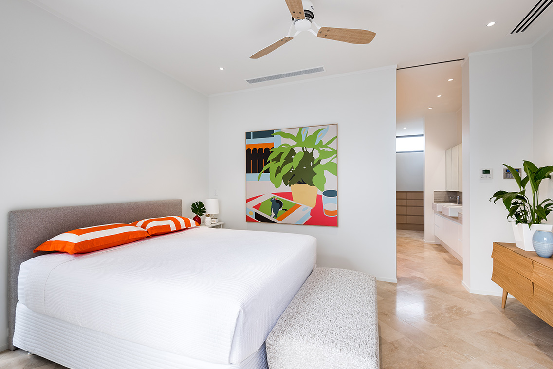
Bedrooms are quieter versions of the public rooms. The main bedroom uses clay-coloured linen and a soft olive bedhead, while the guest room shifts toward pale blue-grey and natural timber. The colours are related to the original artwork without recreating the living area, giving each room its own atmosphere.
Bathrooms continue the palette through stone and hardware rather than paint. Brushed bronze tapware, ivory tiles and a dark vanity bring the same warmth and contrast into smaller spaces. This is a useful reminder that a colour narrative can be expressed through fixtures, grout, textiles and joinery as much as through walls.
Using Art As A Design Tool
The project demonstrates why artwork can be a productive starting point for an interior designer. It offers an existing relationship between colour, scale, movement and emotion. Those relationships can guide decisions when the number of available finishes becomes overwhelming, particularly during a renovation involving floors, cabinetry, lighting and furniture.
The artwork also protects the scheme from becoming too trend-led. Rather than beginning with a fashionable paint colour or a widely used stone, the designer began with something specific and personal. The resulting interiors feel current because they are coherent, not because they follow a short-lived visual formula.
For homeowners, the process can begin with any meaningful piece: a painting, textile, photograph or hand-made object. The important step is to study the work beyond its dominant colour. Look for recurring temperatures, dark-to-light ratios, surface qualities and the relationship between empty space and dense detail.
Local design communities are a valuable source of this kind of thinking. Perth’s design exhibitors offer a window into the materials, objects and creative practices shaping the region, from furniture and lighting to art-led installations. Seeing these works in person can make it easier to understand how a palette behaves across scale and texture.
A Practical Palette-Building Method
The designer’s process can be adapted without reproducing the exact house. Begin by photographing the artwork in natural light and identifying three groups: background neutrals, supporting colours and accents. The background should occupy the greatest visual area, while the accent may appear in only a few carefully positioned details.
Next, collect physical samples. Paper swatches are useful, but timber, stone, fabric and ceramic can alter the appearance of a colour significantly. Place the samples together near a window and view them at morning, midday and evening. Perth’s changing light will reveal whether a grey becomes too cool or a terracotta becomes too orange.
Use repetition with variation. A colour can return in several rooms, but it should not always appear in the same form. Green might be paint in one area, velvet in another and foliage elsewhere. This creates recognition without visual monotony.
- Establish one dominant neutral for walls, floors or large built-in surfaces.
- Choose two supporting tones that can move between upholstery, cabinetry and textiles.
- Reserve the strongest colour for objects, art, cushions or a single architectural feature.
- Repeat material qualities as well as hues, such as matte finishes, visible grain or woven texture.
- Test every sample against the artwork and the natural light before committing.
The final edit is as important as the initial selection. Remove colours that do not strengthen the connection between rooms, even if they are attractive on their own. A restrained palette leaves space for the artwork to remain active, while carefully placed contrast keeps the home from becoming flat.
A local design event can extend this process beyond the home. Contemporary Wine In Design brings together architecture, interiors, products and creative practitioners in a setting built around conversation and exchange. Visitors can claim a free pass and encounter the broader network behind the region’s design culture.
The house ultimately succeeds because the artwork is treated as a source of relationships rather than decoration. Its colours are softened, separated and reinterpreted through the architecture, allowing each room to feel individual while belonging to the same composition. For anyone shaping a renovation or new build, choosing one meaningful visual anchor may be the most direct way to create an interior with clarity, warmth and a lasting sense of place.
Start with the artwork that already matters to you, gather material samples around its quietest and strongest tones, and let those discoveries guide the next decision. A considered palette can turn a collection of rooms into a home that reads as one connected, evolving piece.